Research - Creative Writing - Book Design - Lettering - Print Production - Creative Binding - Photo-Editing
Close your laptop.
Get out, and search for a local dying craft around you.
Get out, and search for a local dying craft around you.
As a junior in my university, I heard that the seniors had a really cool brief for their final year projects. My curious nature just went to their teacher and asked about it. And here I am now, presenting to you my award winning project.
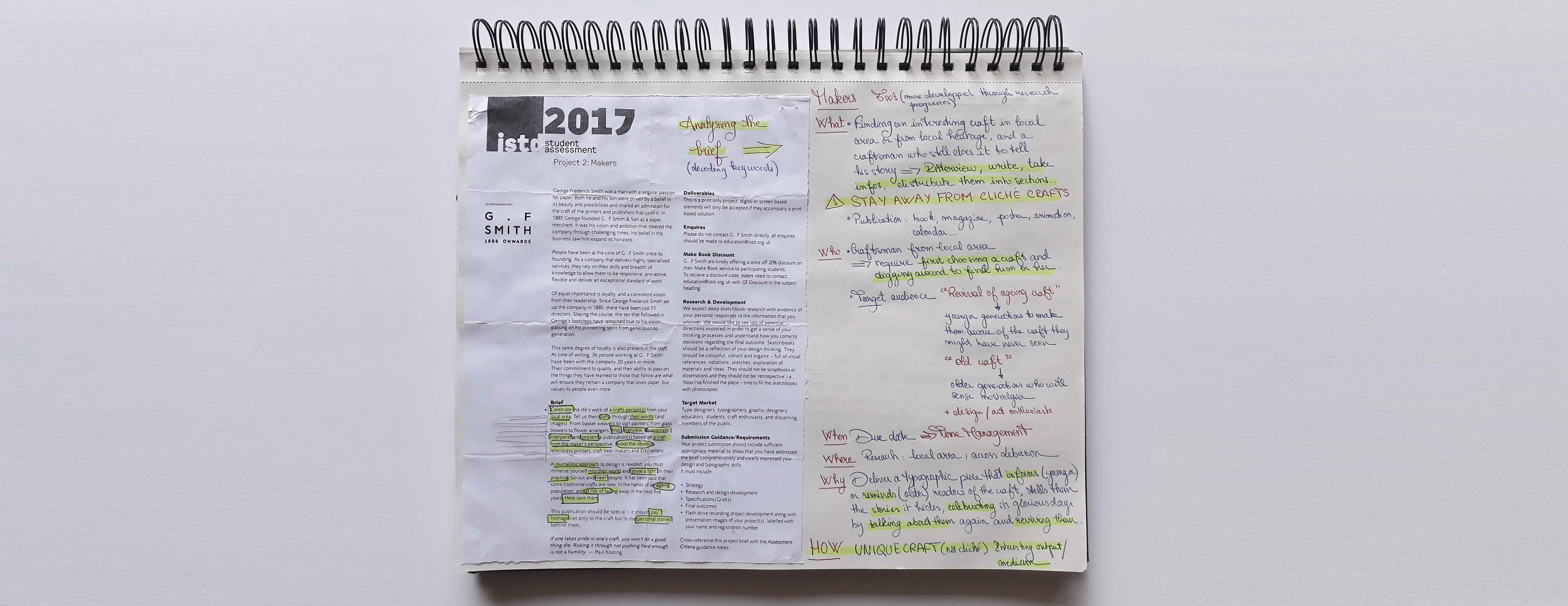
Here's the brief in a nutshell: Go out, talk to people, interview people, and find a local dying craft you want to celebrate.
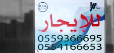
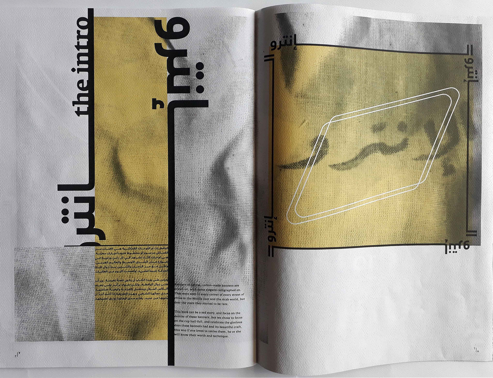
All students got stuck with the basics: pottery, wood crafting, sculpting. I wanted to stand out. While walking around town one day, I came across a 'For Rent' sign, hand-painted on cloth, mounted with a wooden structure. At first I didn't really think much of it since I was surrounded by it my whole childhood/teenage years, but then I noticed that the ones I was seeing lately were all printed, not hand-crafted... Bingo.
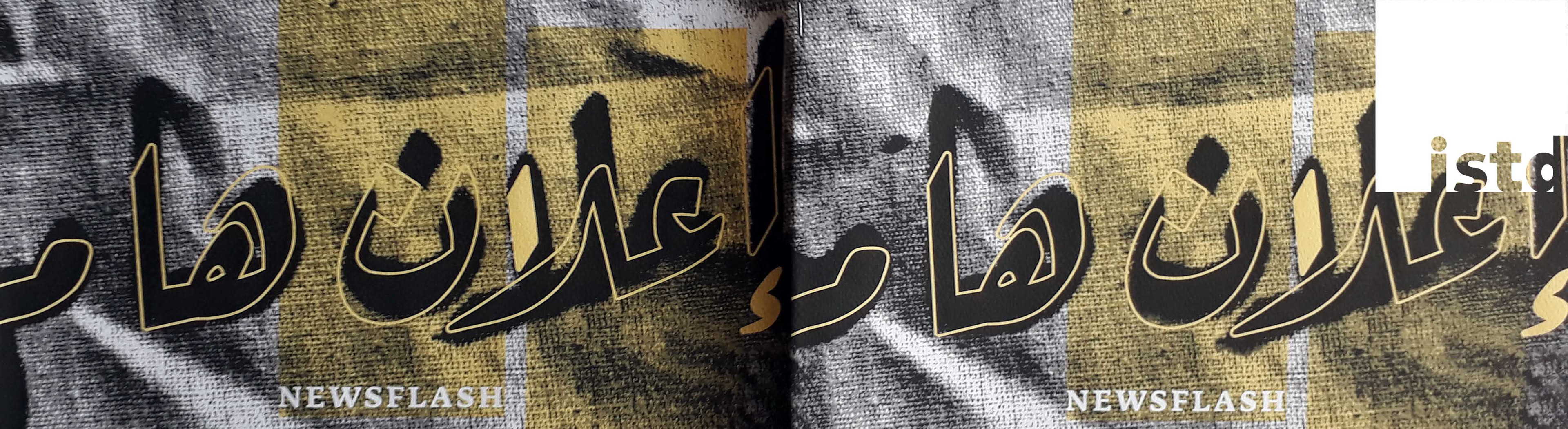
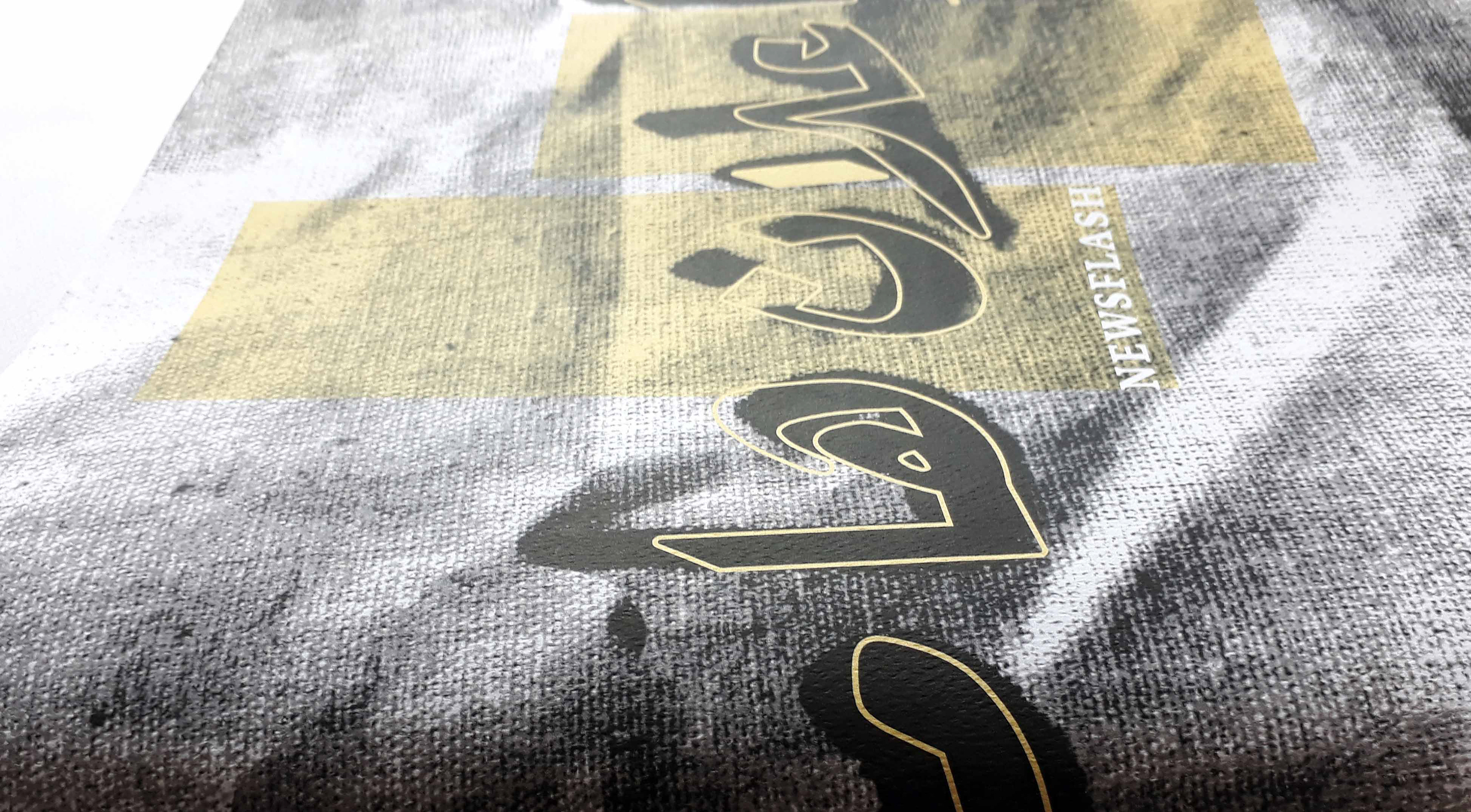
After the Industrial Revolution and the introduction of the machinery into the commercial world, the printing press got developed and took over all publications, ephemera, posters, etc. Through the years, Lebanon lost this spark of an art-form that was stylizing banners made from cotton, fully by hand.

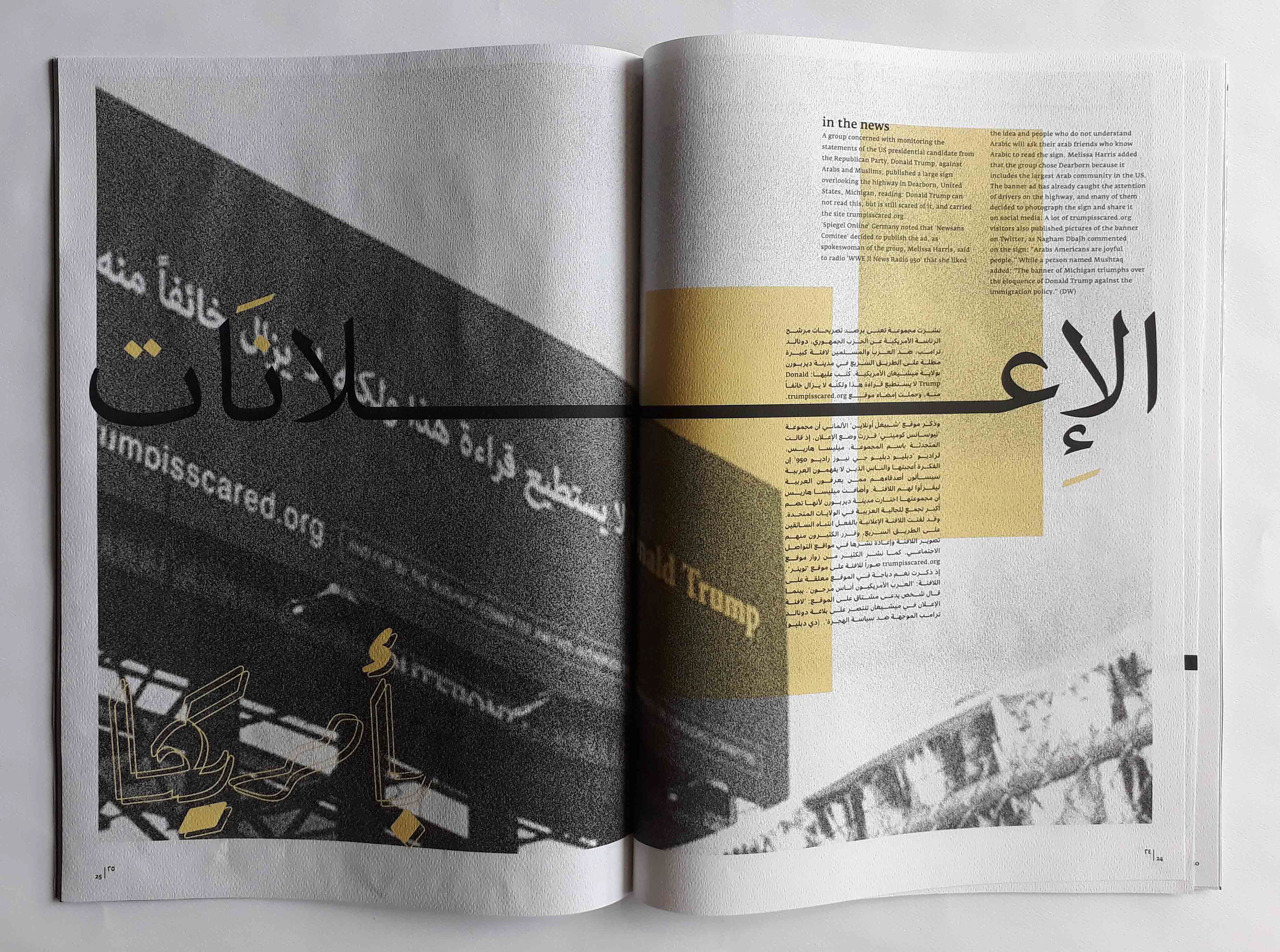
Consequently, these banners began to be printed, with fonts that did not adequately follow the rules of written Arabic. Unlike the latin, Arabic has three major rules to follow no matter the style being used. Certainly a latin letter's structure is to be followed, but for Arabic, length, thickness, and similarity must be found, and done according to a designated proportion.
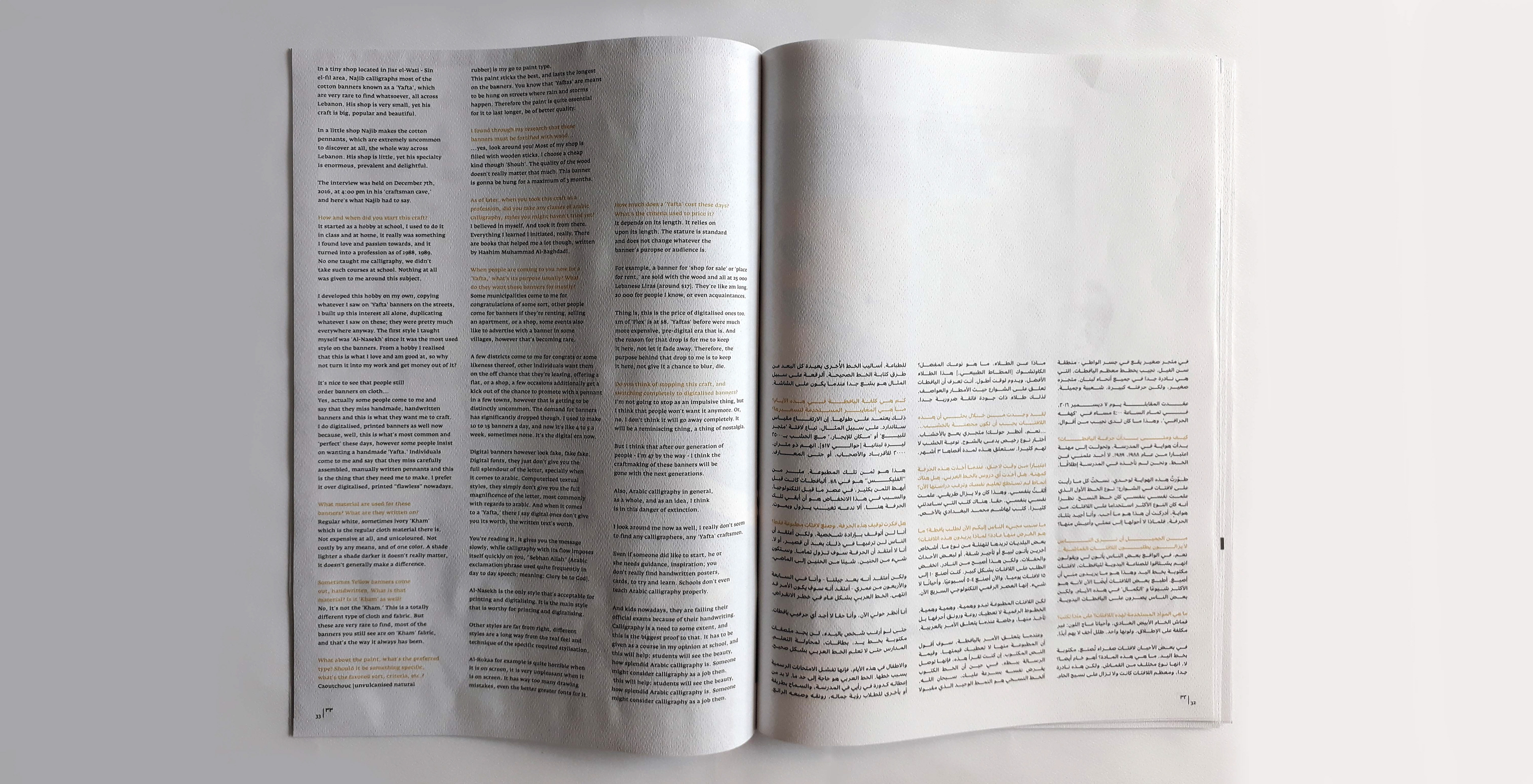
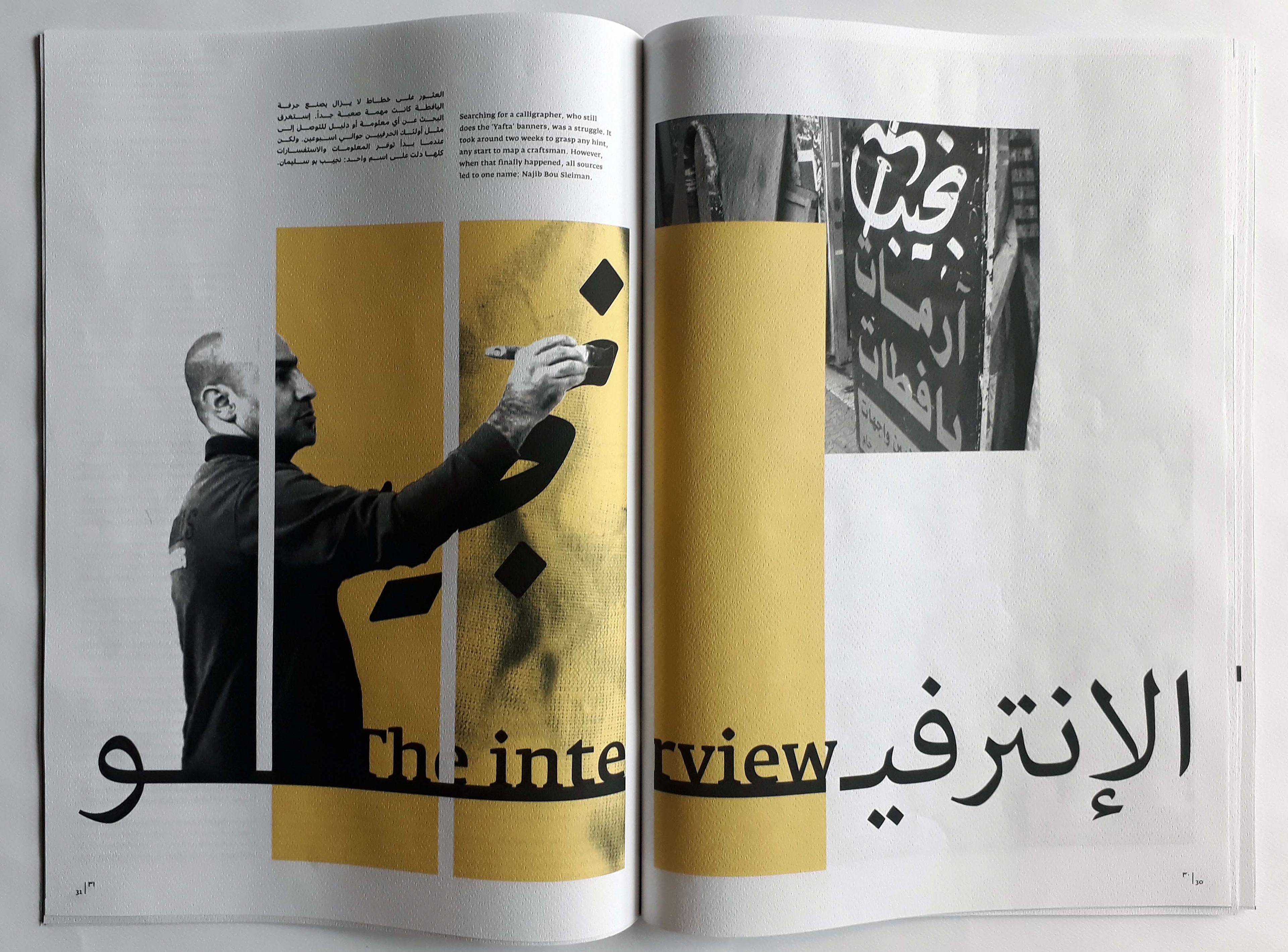
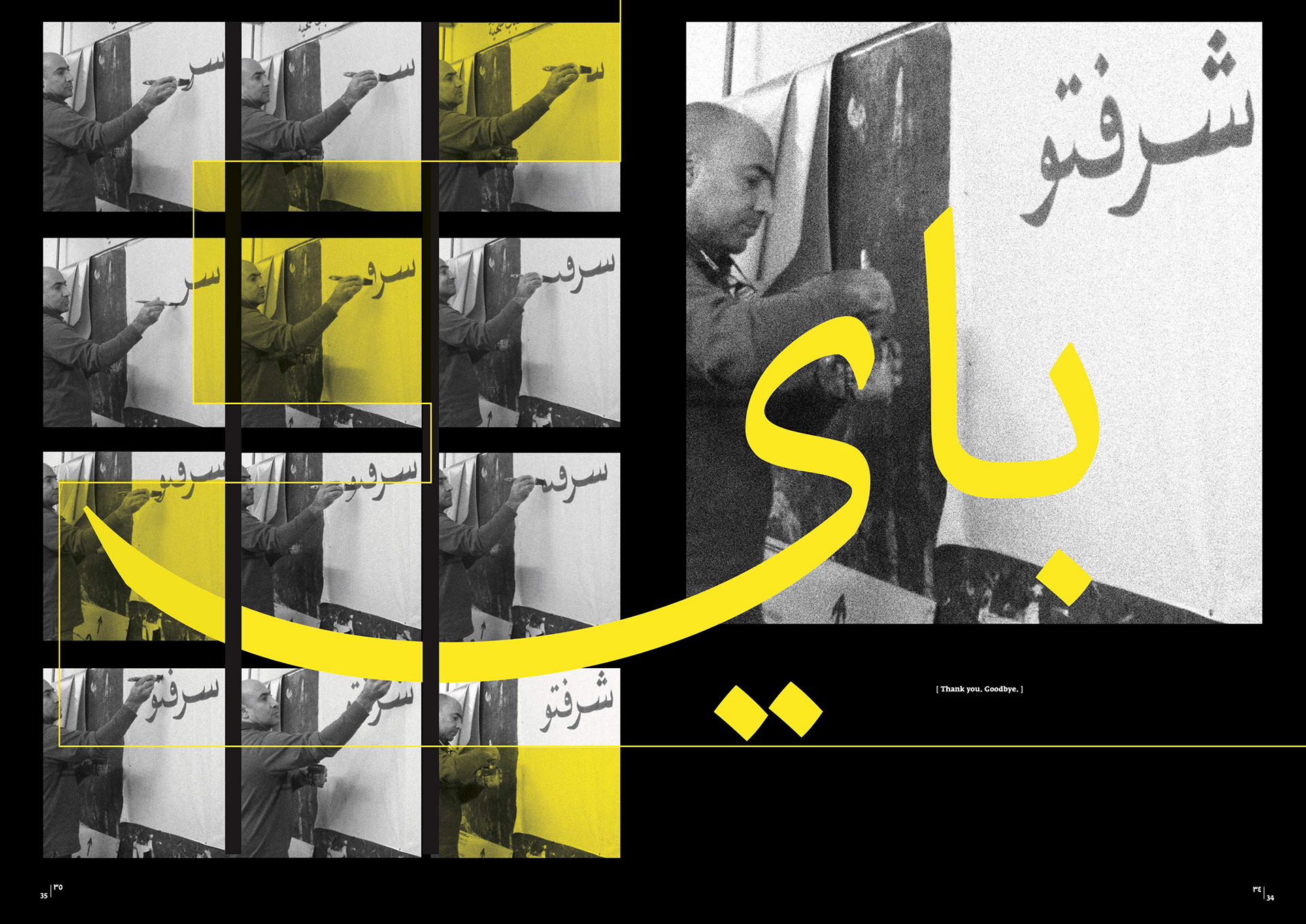
It's good to mention that not a lot of calligraphers were available or able to make these banners anymore. I went all over Lebanon until I eventually found just one calligrapher that still does this as his (side) job.
The Design Solution
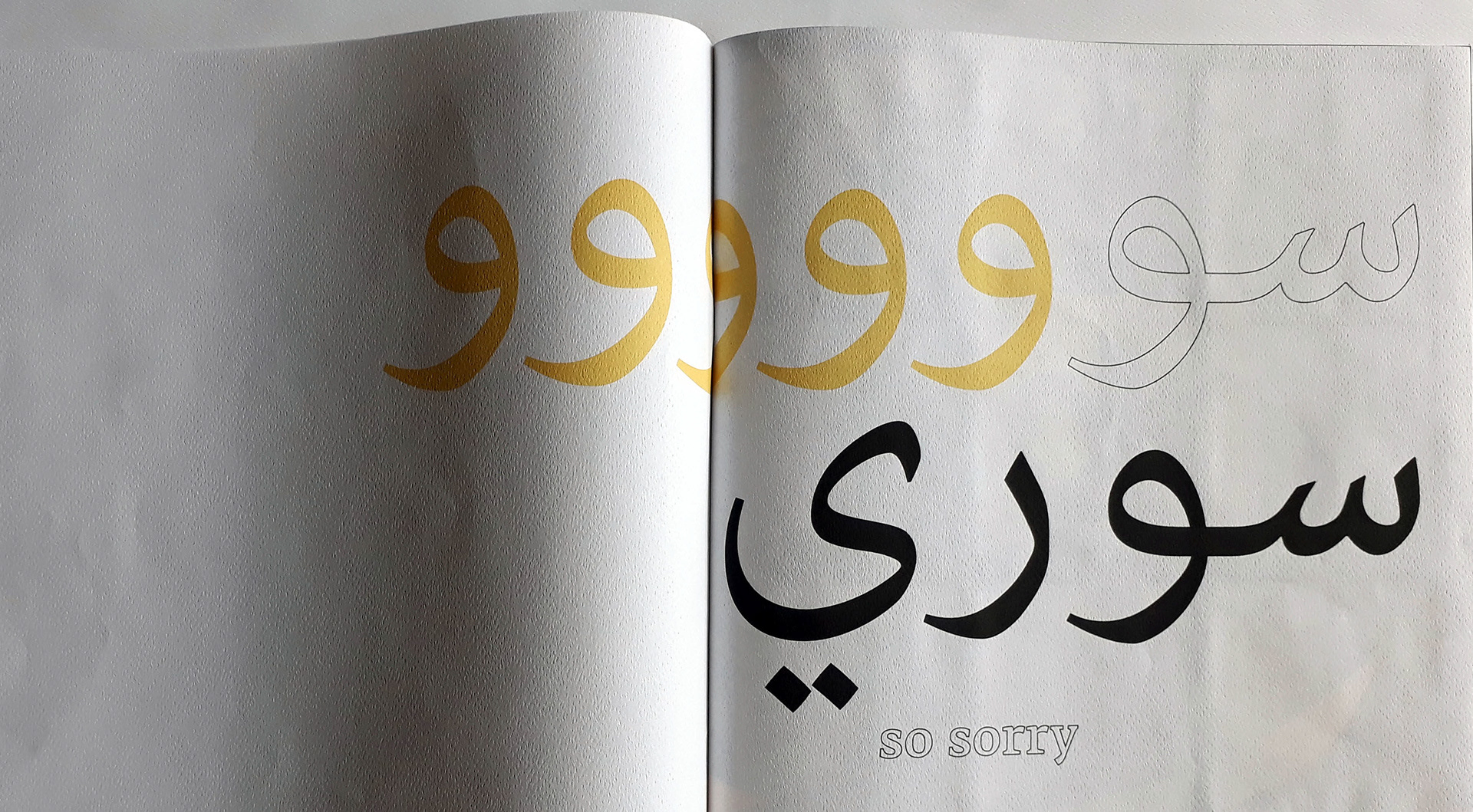
The book is designed to start from right to left reflecting the flow of the Arabic script. The whole focus is on the Arabic language since it is embedded in that craft. The book has the same front and back covers. However when you open it the 'Latin script way,' a "sorry" message page is there to inform you about the book's technicalities.
With the pages flowing from right to left, the tricky part was the flow of the Latin text. After a lot of trial and error the best visual and functional outcome was for the Latin text to be aligned left , with the information beginning and ending on each page. No running text from page to page will confuse the reader.
The size of the publication is an A2 format. A cotton banner could go up to 6m, even 10m on some occasions, and so it made perfect sense for the publication to be as big as possible. Clarity is a huge plus too.
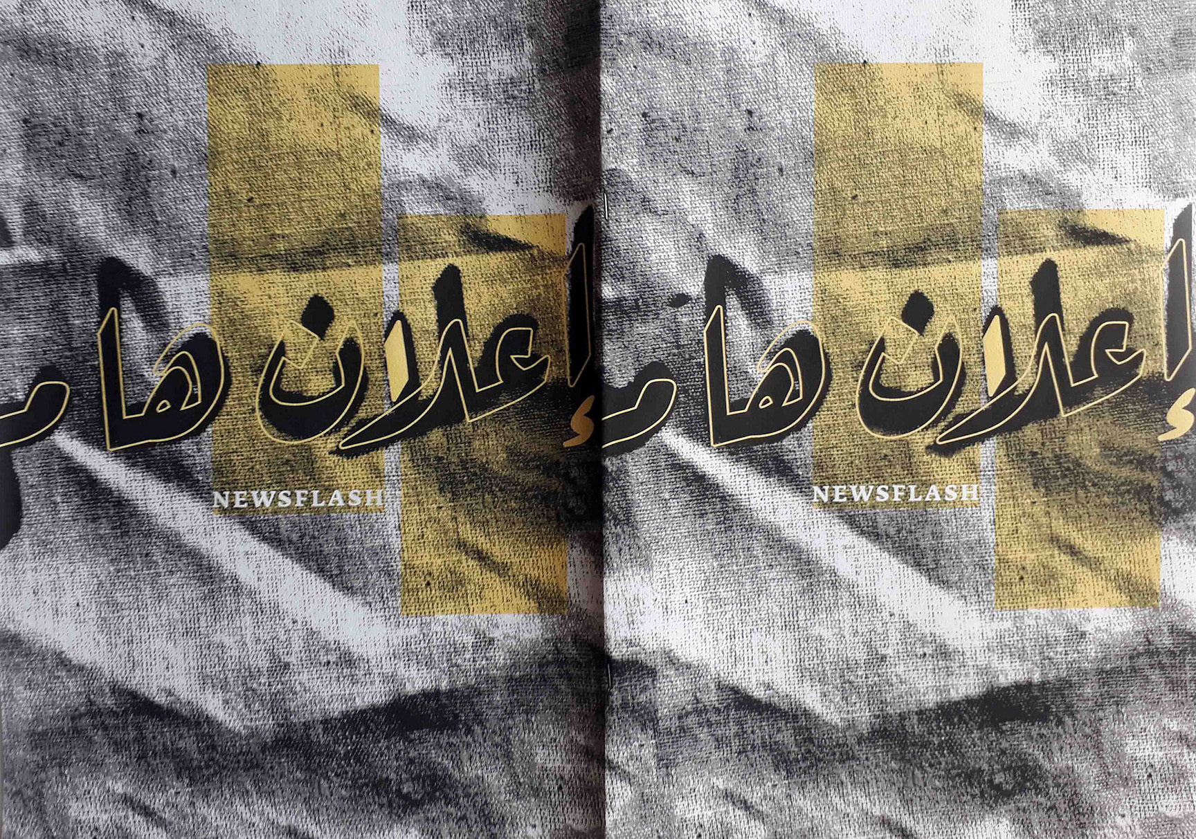
The main colors chosen here are black and yellow. When we talk about reviving a craft, the yellow on black contrast visualizes that reborn narrative.
The paper chosen is a kind of paper that feels like the cloth texture - which is what the banners were originally made out of.
I made the calligraphy photographed, by the way!
Enjoy the gallery!
By the way,
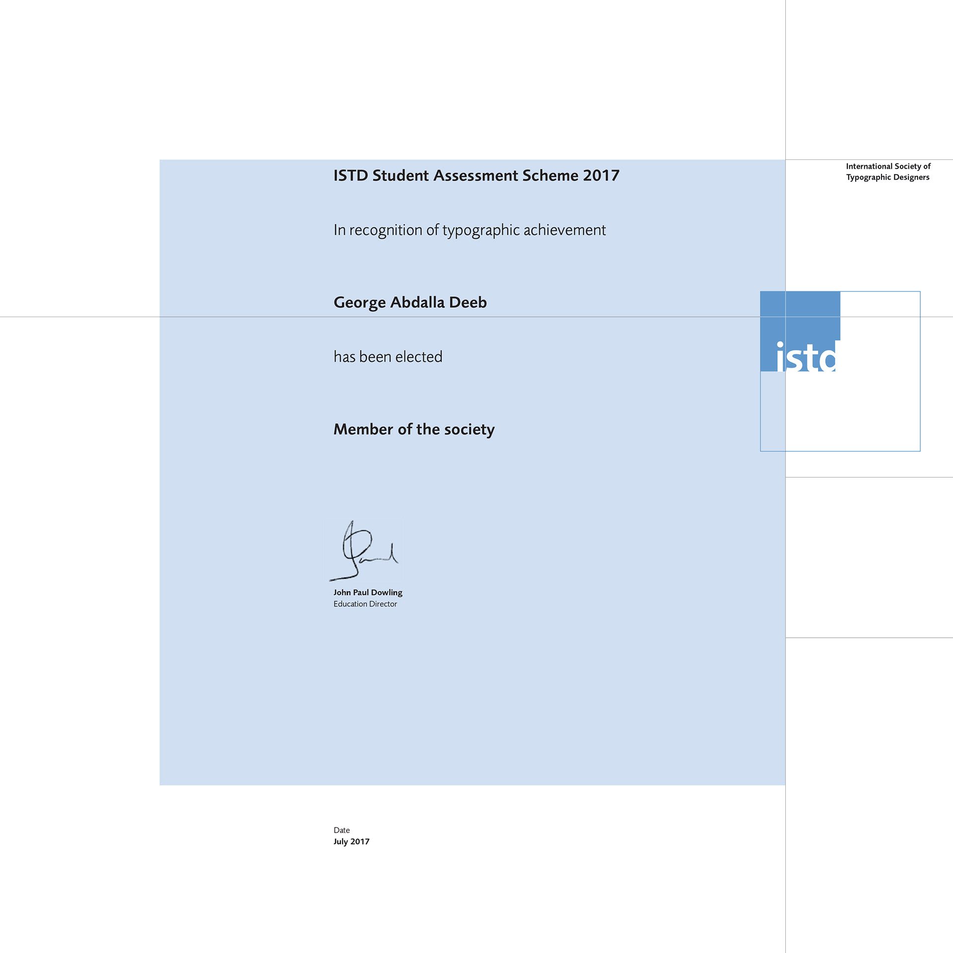
this is an awarded project!
ISTD Student Assessment
2017 Winner
this is an awarded project!
ISTD Student Assessment
2017 Winner