Research - Creative Writing - Calligraphy - Lettering - Type Design
So back in 2017, I enrolled in this really cool intensive Arabic Type Design Beirut program arabictypedesign.com that was happening in AUB for 6 weeks. Being fascinated with Arabic letters, and ATDB happening in-between semesters, it just made perfect sense to go, and the rest is history. Actually, it's revival of history.
2017: The start of an end.
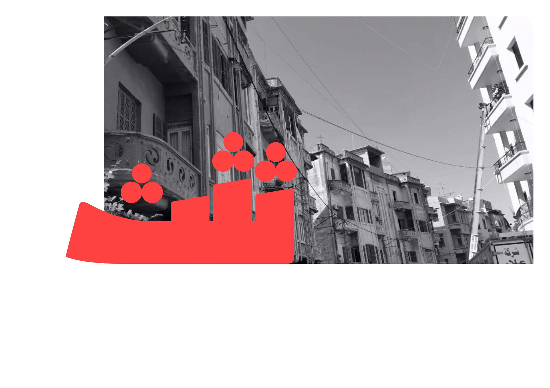
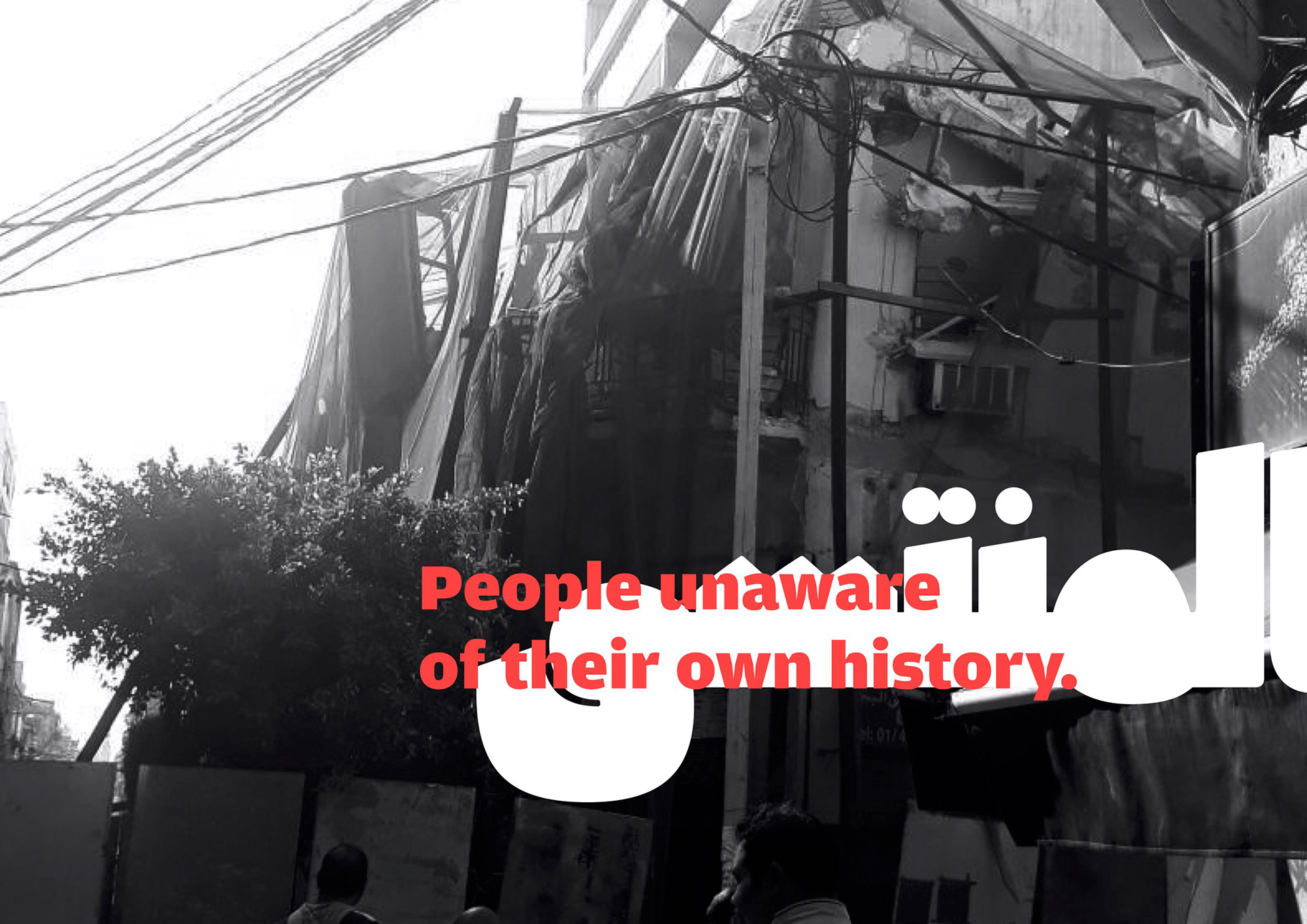
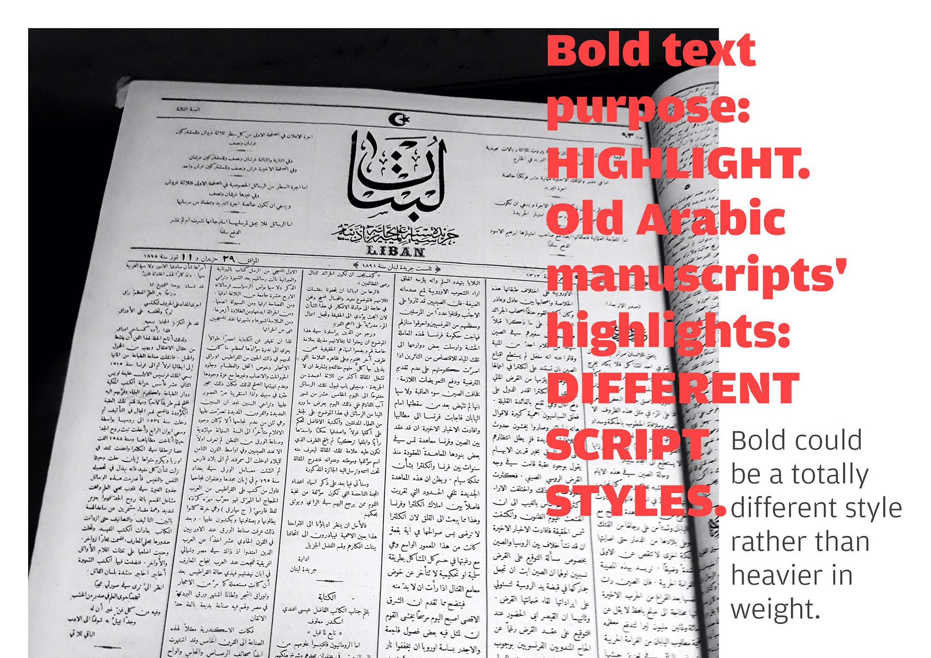
While in the program, some interesting things were happening in the area. There's a street on my way from my house to AUB that was labeled as the 'historical street of Gemmayze.' Indeed this street is just filled with buildings that date as far back as 1930s, Art-Deco architectures, just a beautiful blast from the past, until they were blown by a literal blast.
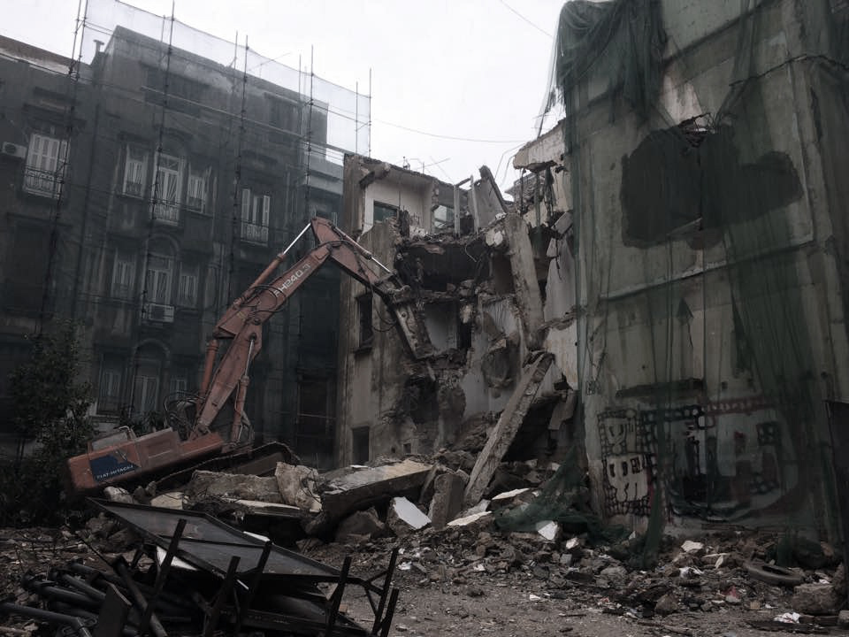
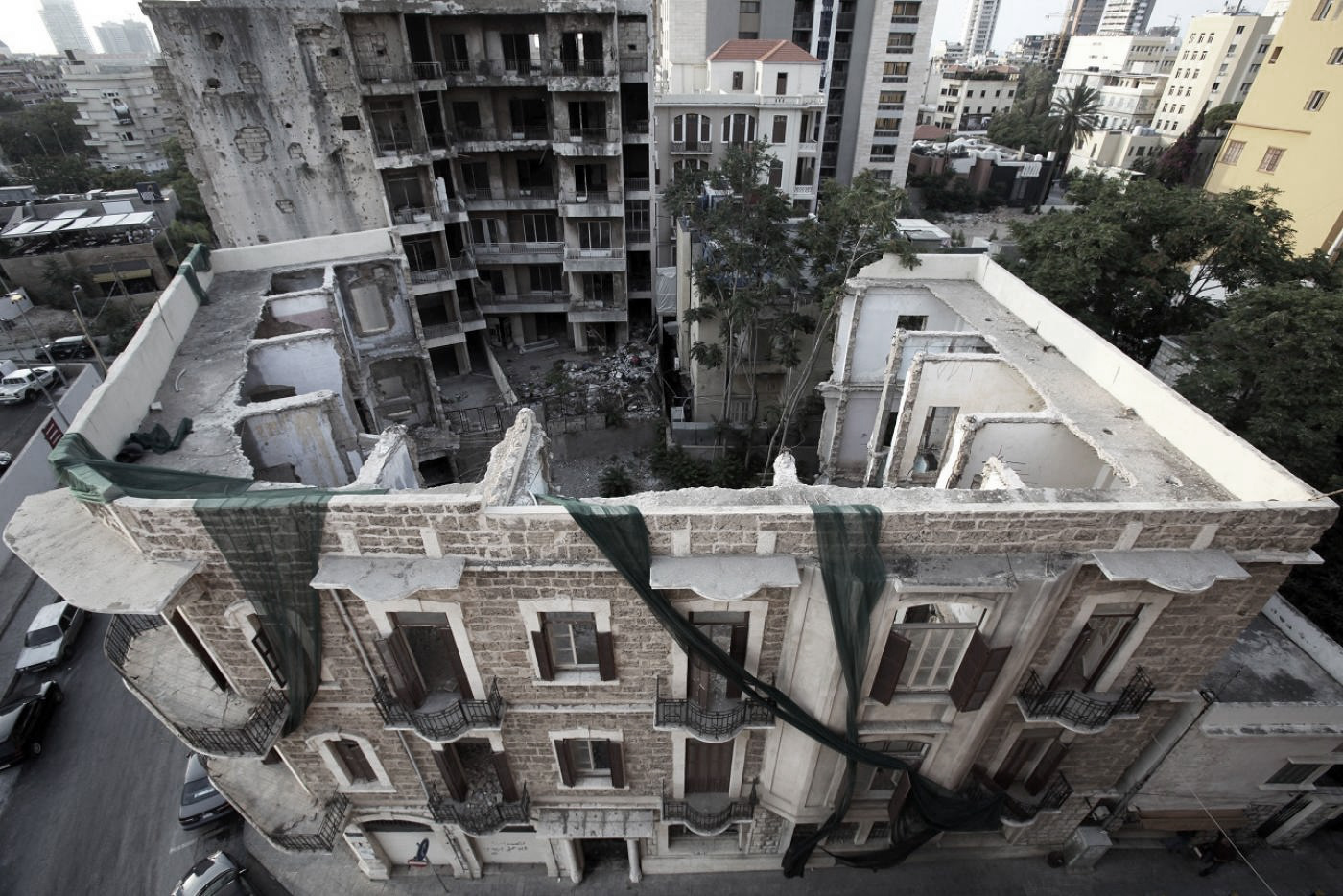
Gemmayze Street, 2017
As you can see, the visuals above are just heartbreaking. All of this was happening, and the people didn't care. A couple of organizations like Save Beirut Heritage were trying their hardest to fight back and stop this atrocity from continuing, and that's it. And that got me thinking, what could be the root behind people not caring about this more? And it's simple: People are unaware of what Lebanon packs in culture and history.
Meanwhile in the studio...
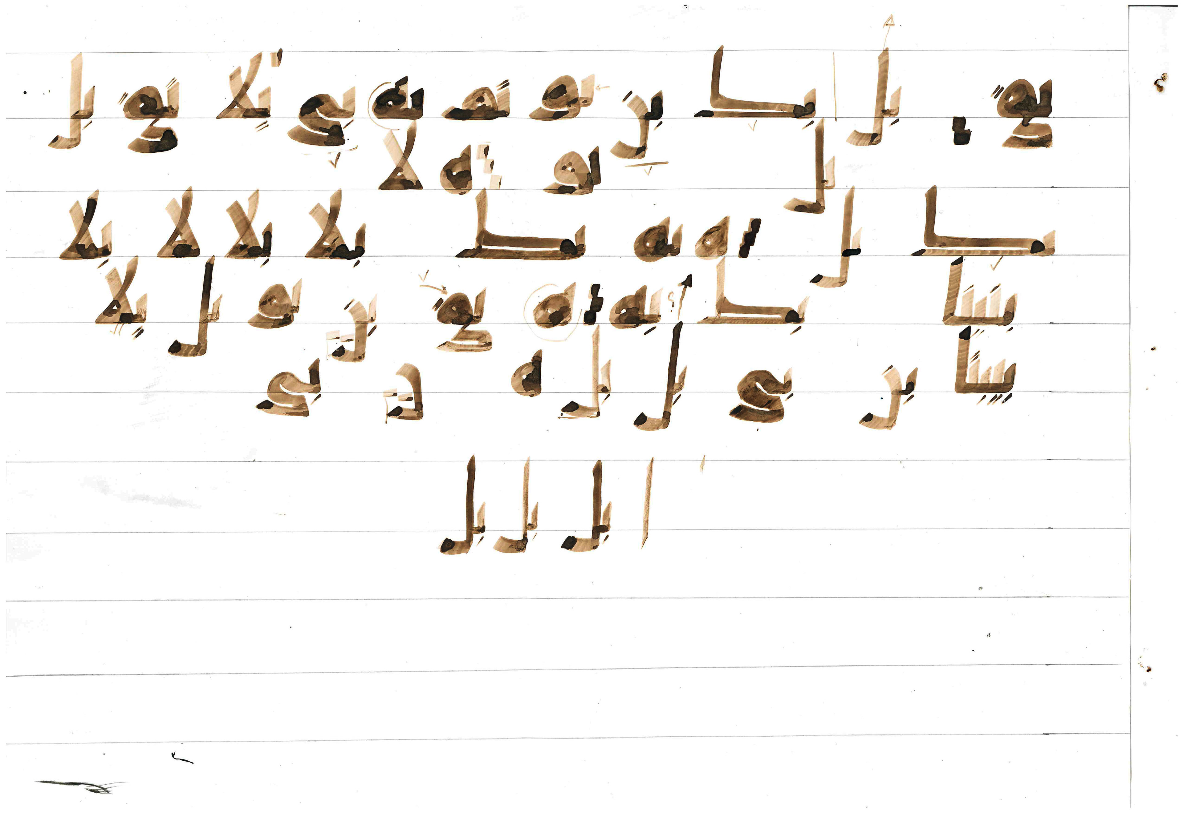
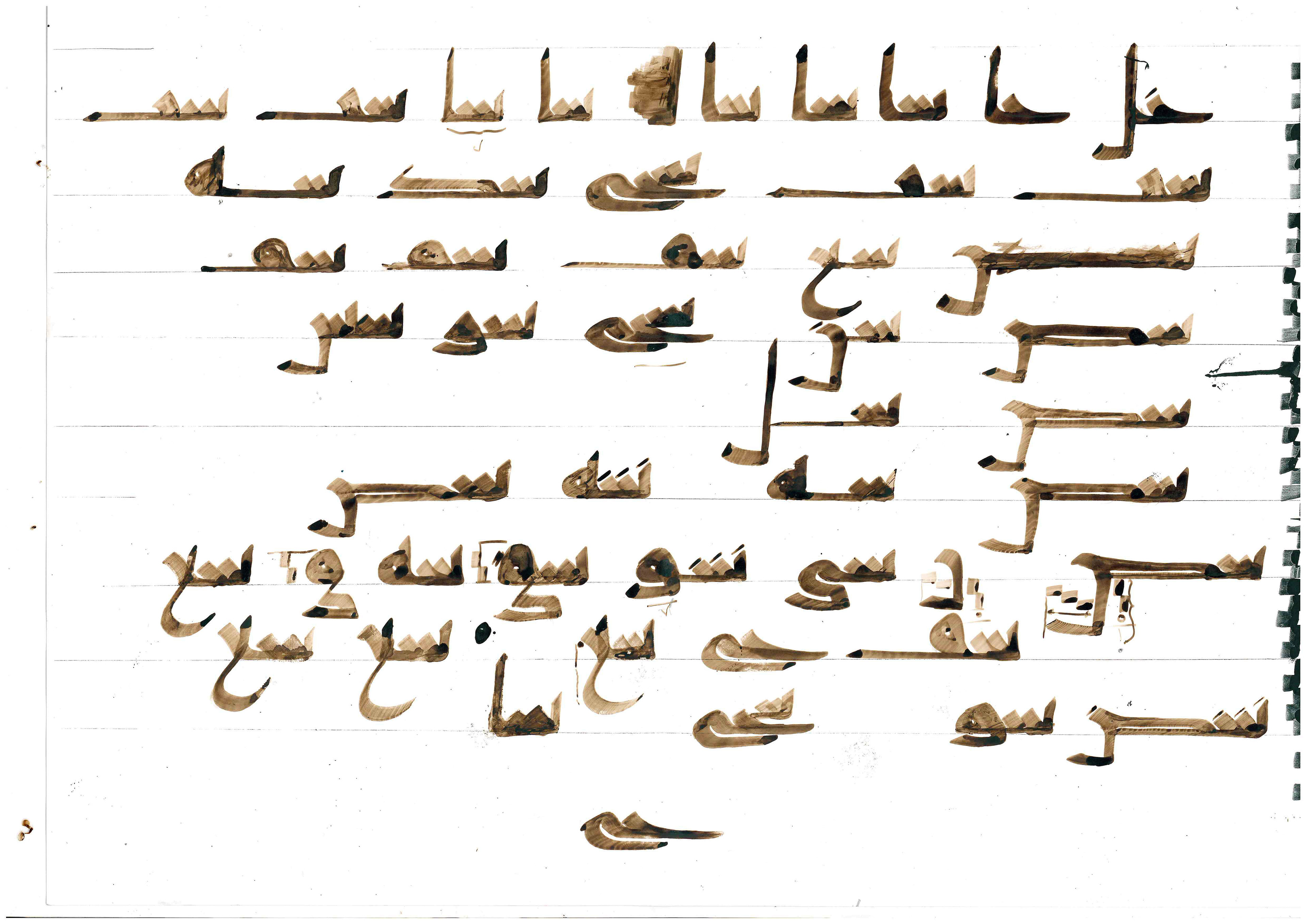
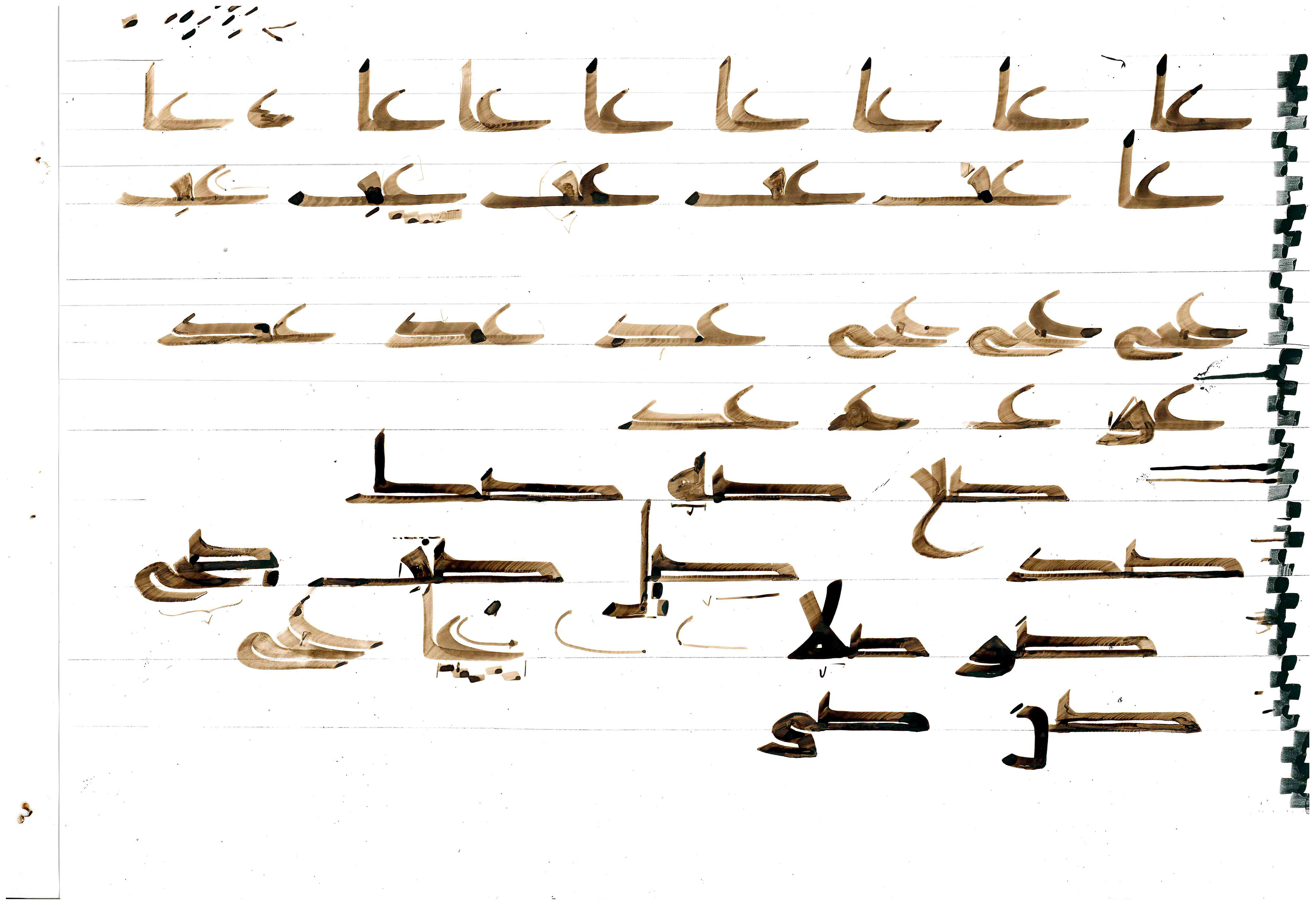
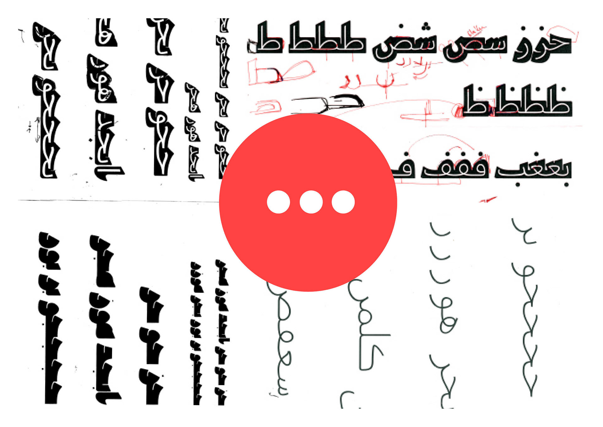
Learning how to calligraph an unknown script
Look at the pictures above. Beautiful, no? All of them are considered to be the root shape of the Arabic script, or at least one of its first recorded forms. The idea that I did not know about that, made me not care about not learning about it earlier. However, once I was aware of its existence, I wanted to share this cool finding with everyone. And every time I brought up the subject, people would be fascinated.
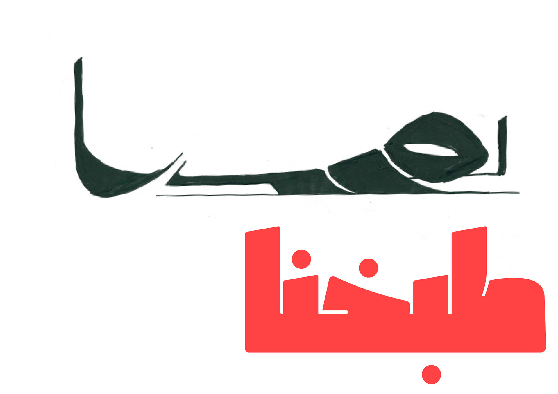
Adding to all of this, the shapes of the letters reminded me of the historical buildings shown before. Their story of course, but also their shapes, curves, essence. Something about the two just clicked perfectly.
Jawzaa Arabic:
The rebirth of an era
The rebirth of an era
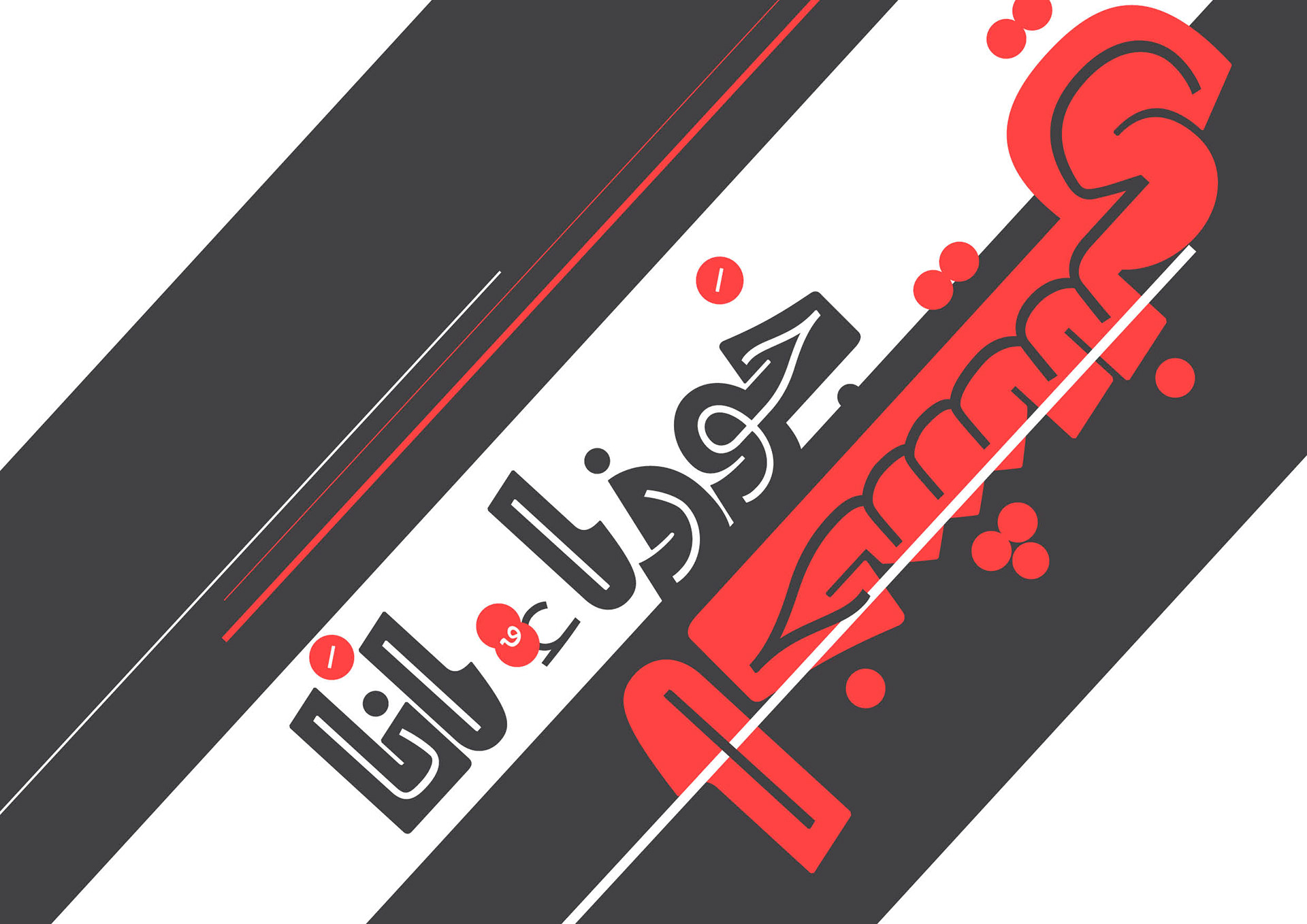
Storytelling through a typeface
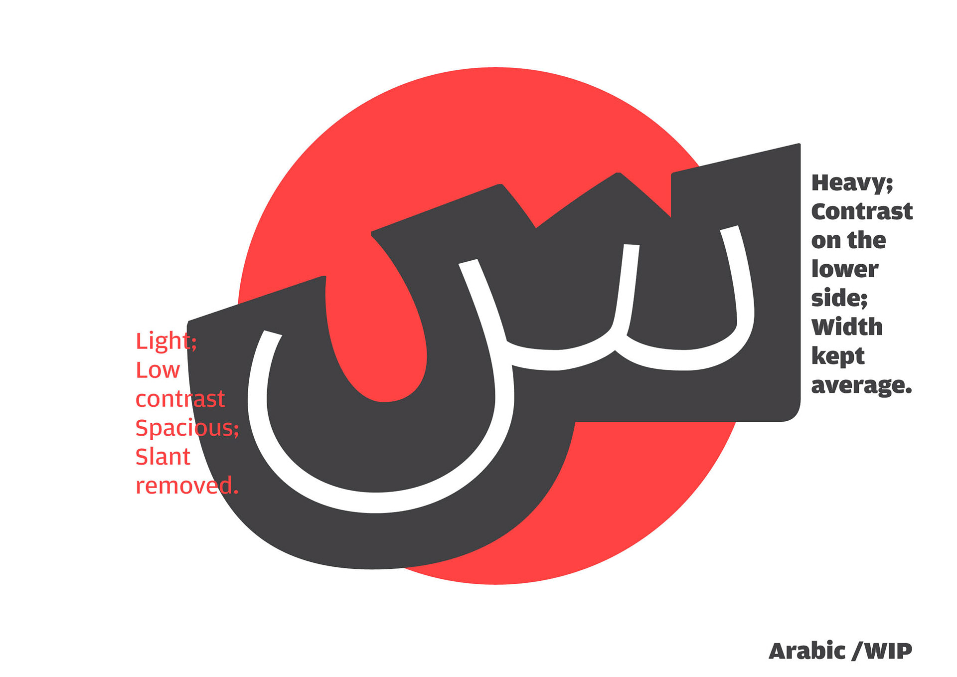
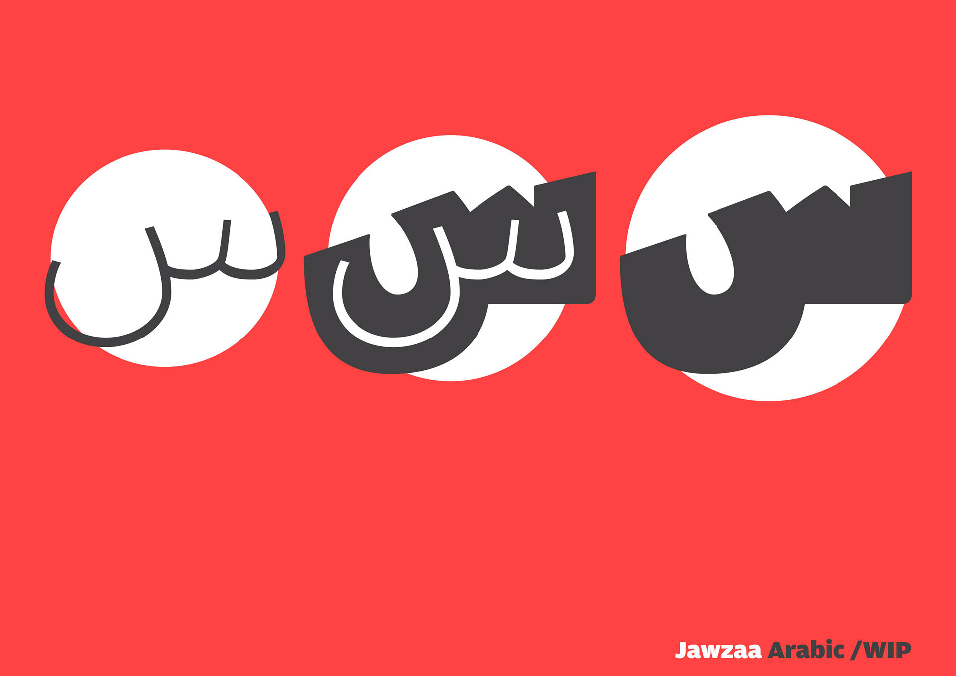
Jawzaa Arabic is a Gemini (I can say that because I'm a Gemini too): two extremes in one. People won't be able to read the original script as some letters look nothing like their current shape. Therefore, Jawzaa will take the extreme past and the typical modern shape we have now, unify both extremes in one letter.
& we started cooking, trying & trying to perfect the recipe:
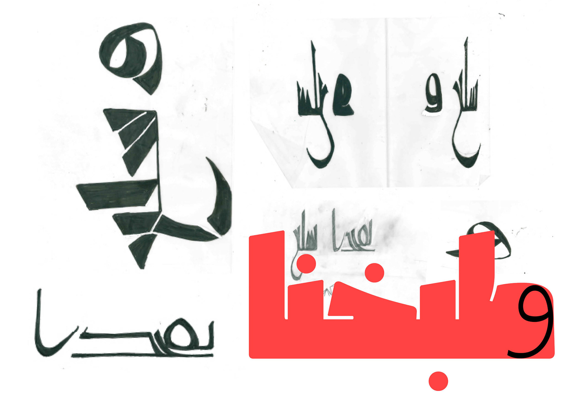
& here's the finalized
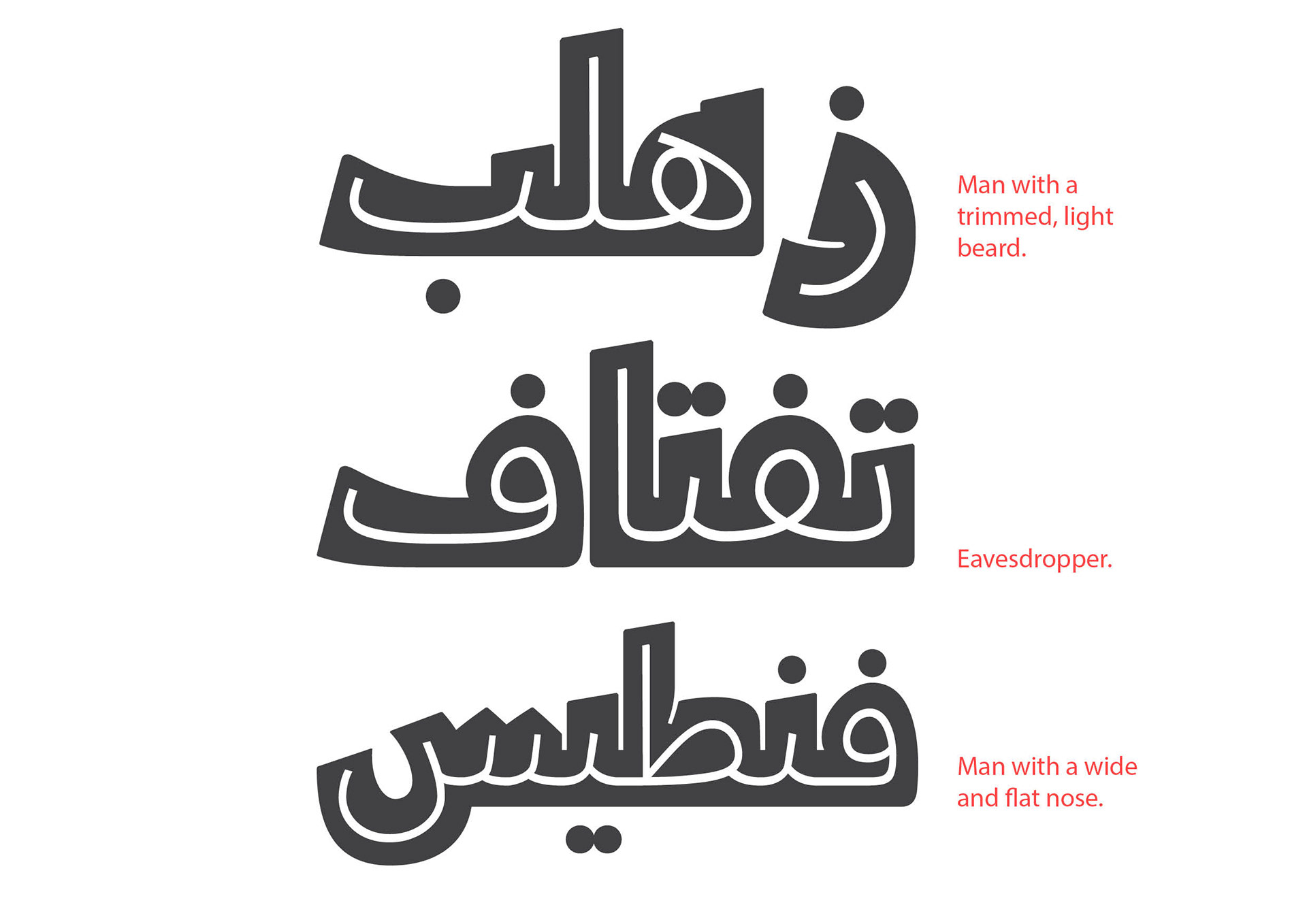
Jawzaa Arabic recipe
Jawzaa Arabic recipe
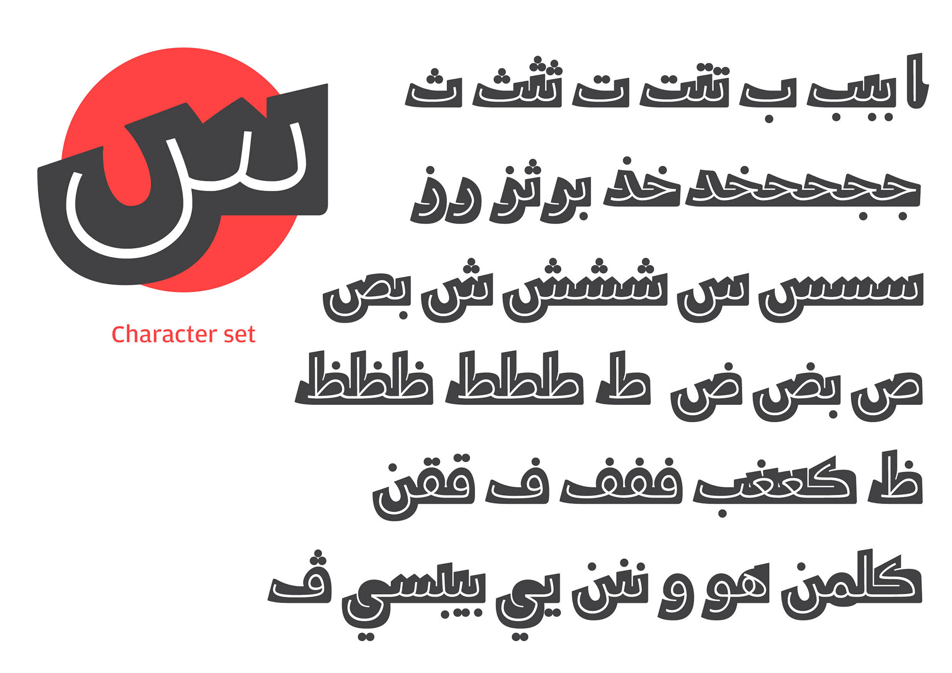
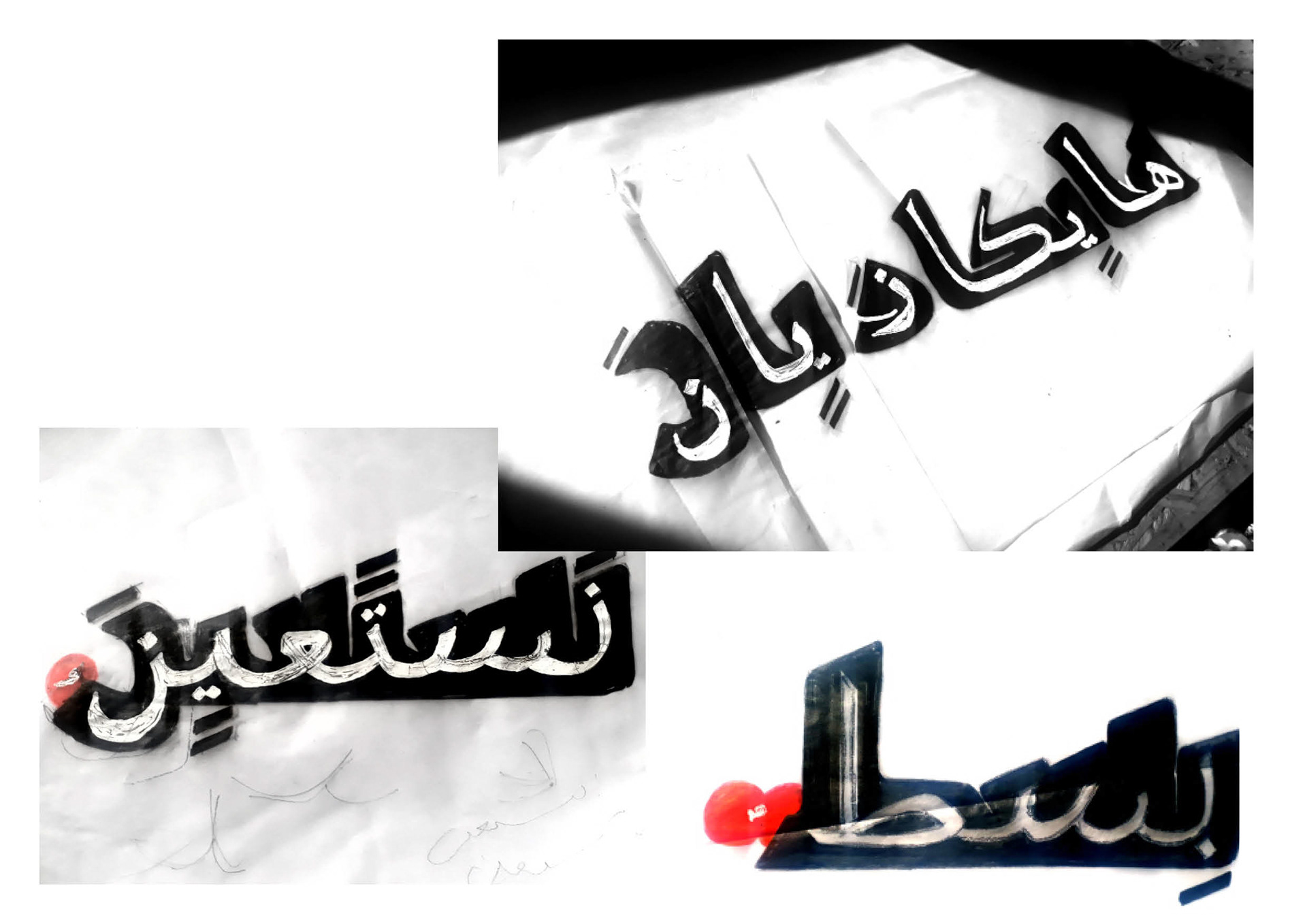
Some cool features:
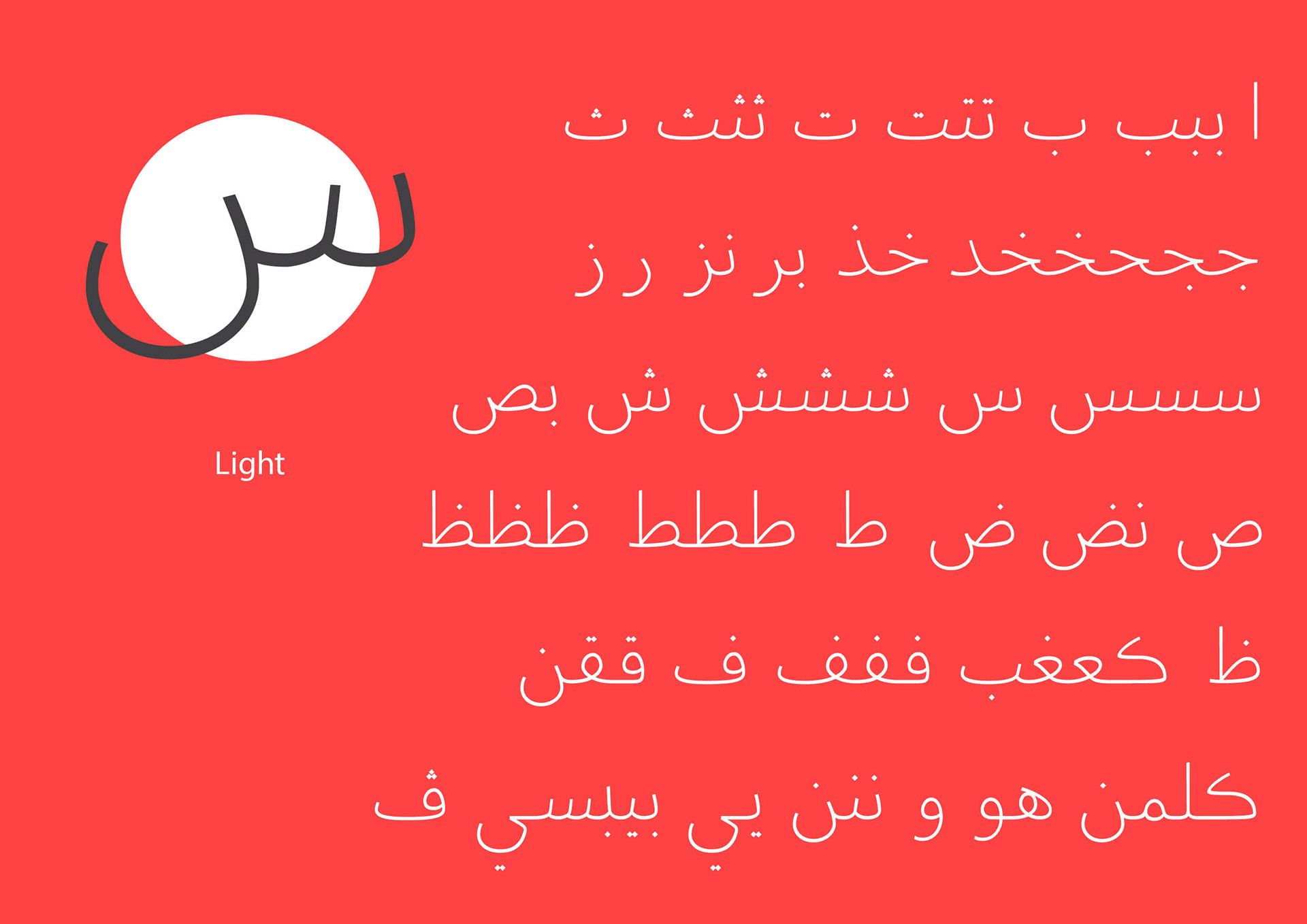
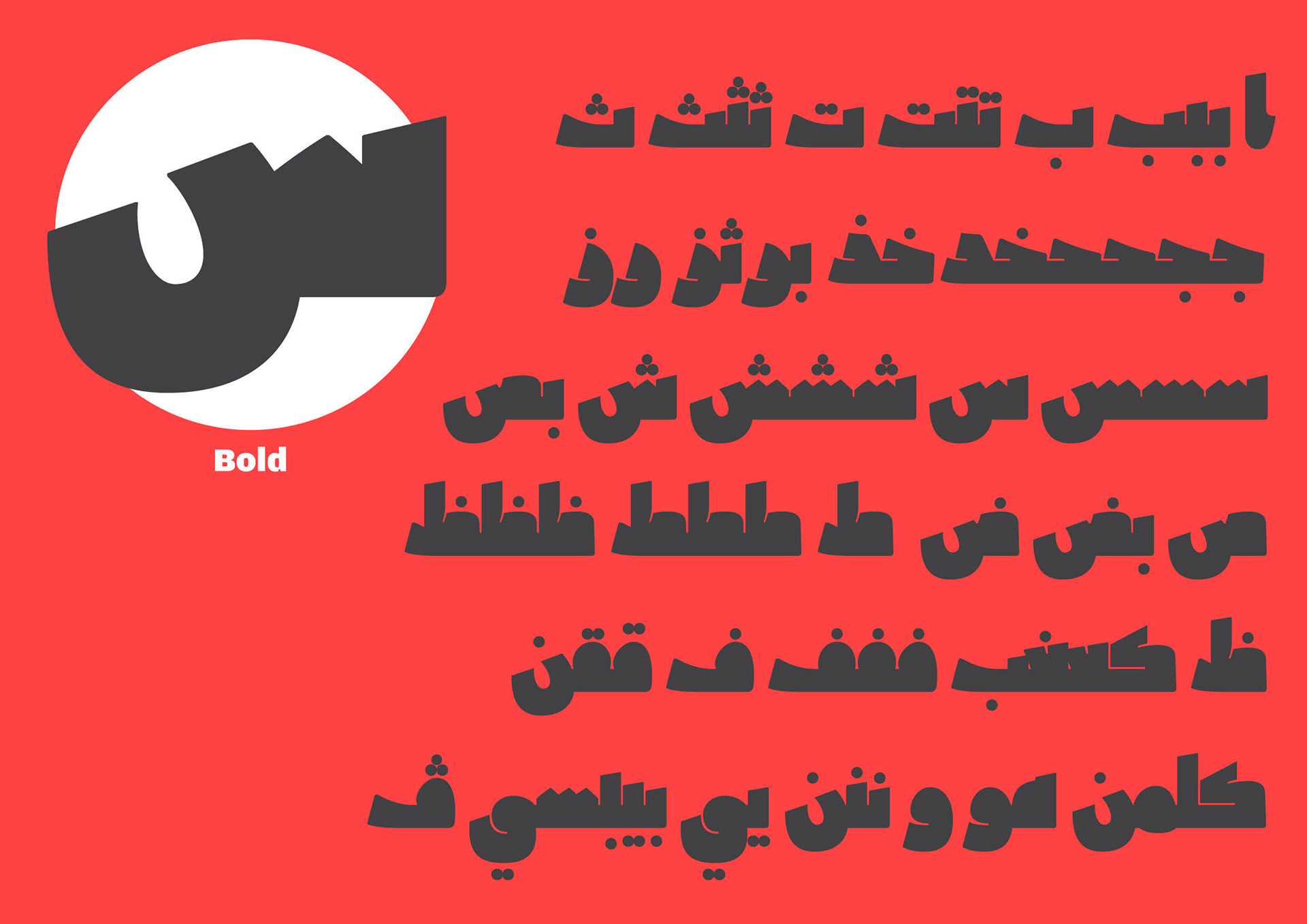
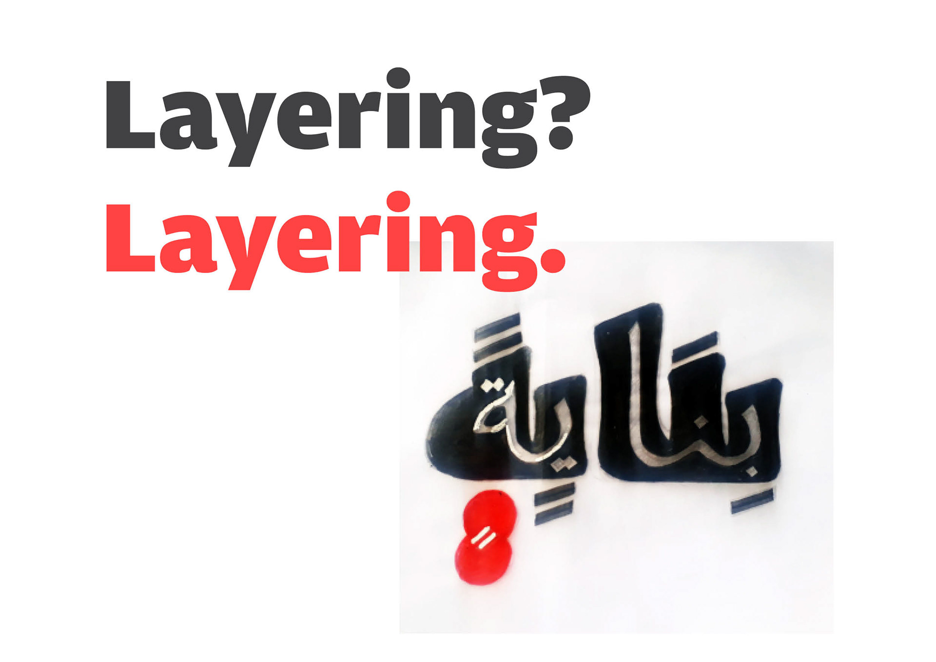
Deconstructing the layers, which are two different styles, and making 'the new' light and 'the old' bold, just made the font much more interesting. And, the nature of the scripts used make the latin way of viewing weights also be applicable to Jawzaa Arabic.
Missing glyphs,
& the ones that changed.
& the ones that changed.
Fear us Geminis.
The Hamza 'ء'
The Hamza, in general, was not a letter in the older versions of the Arabic script. It got added with the modernization of the script. Therefore, no bold letter for the Hamza, you will just use the light one on all weights. It's just a cool feature to the font to make it more interesting, and historically accurate.
The vocalization marks within a circle
Yup, the vocalization marks were just colored circles back then. Just like the letters are layered, the vocalization marks follow the same logic.
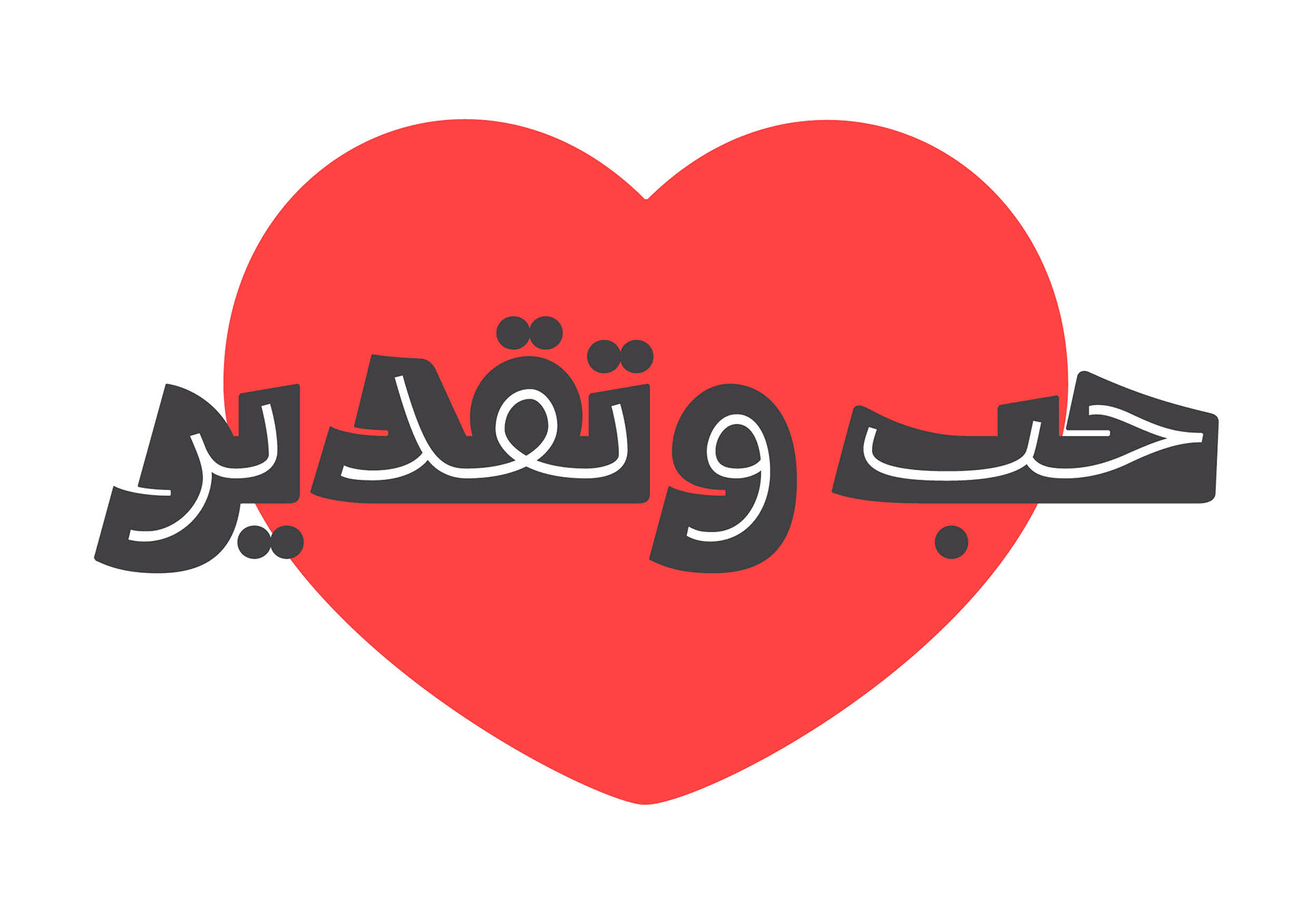
The Branding
These three words disappeared from the dictionary. Just like the script. Just like the building. The font is all about revival.
A link to my face on the ATDB website: http://arabictypedesign.com/works/2017/george