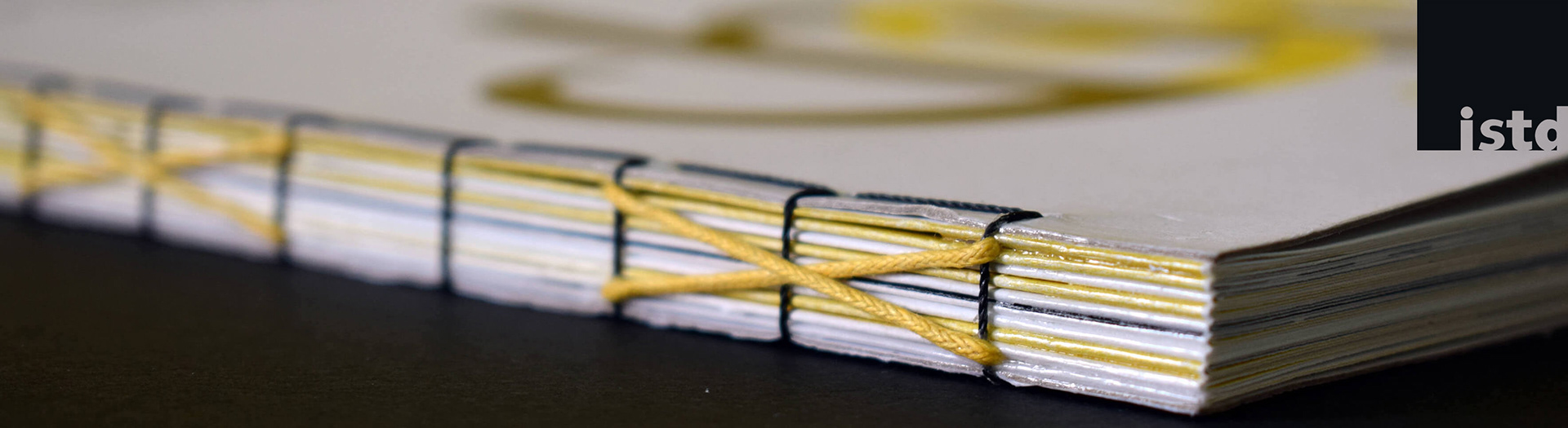
Research - Creative Writing - Book Design - Lettering - Print Production - Creative Binding - Photo-Editing
Can I have your attention, please? There's this number that I want to quiz you on. So, just assume a random number exists. Call it something. What did you name it? Pretty sure it was something along the lines of 'x,' huh?
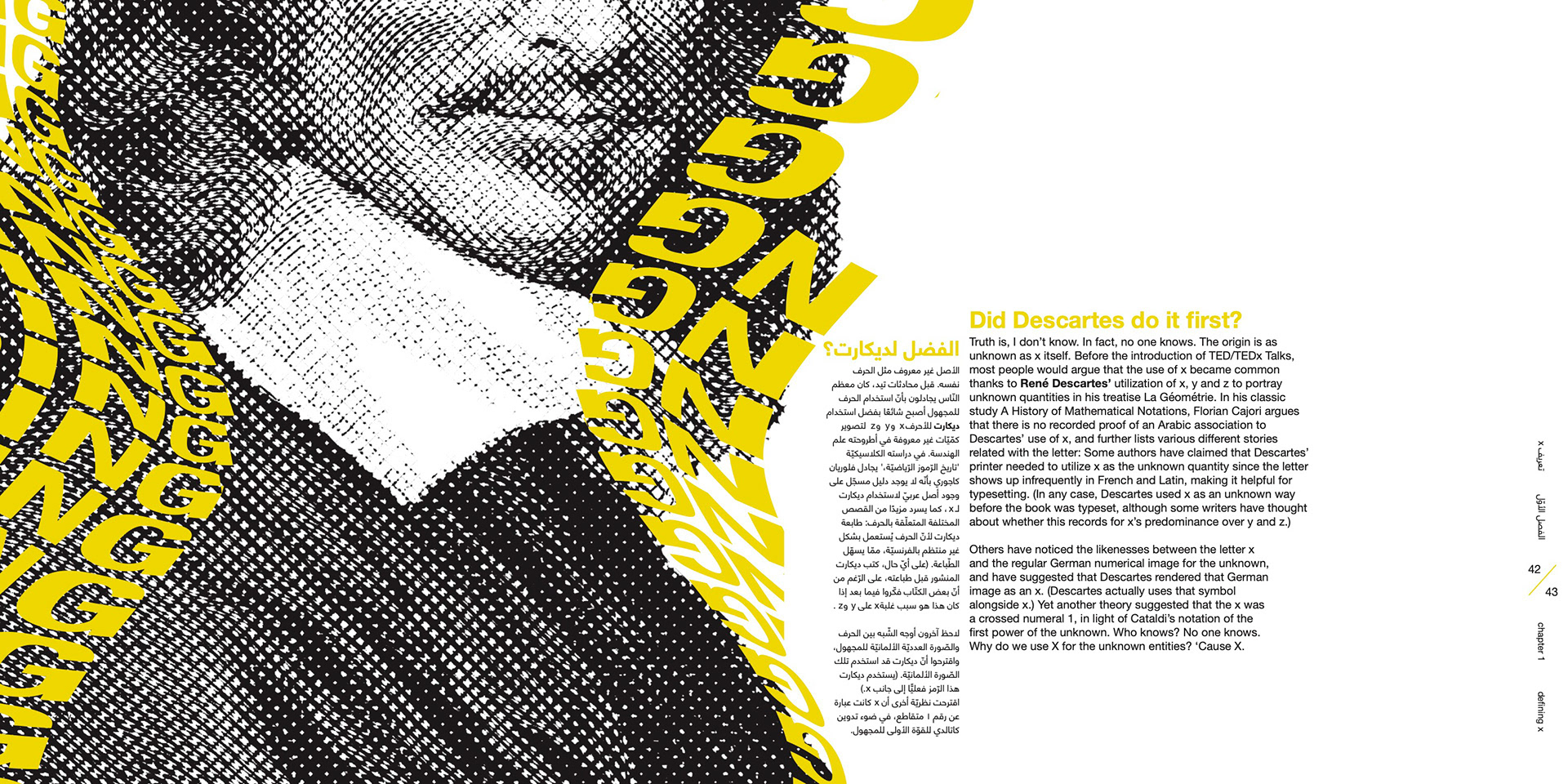
Have you ever wondered why we innately go for the letter ‘x’ when you want to write down an unknown matter?
Here's what happened. I got briefed on my senior university project, and the brief was: "Just get lost and make me lose myself in your theme" (existential - I love it.)
I was researching a completely different topic, when I unconsciously wrote down ‘x’ for an unknown number, and then I thought to myself:
I was researching a completely different topic, when I unconsciously wrote down ‘x’ for an unknown number, and then I thought to myself:
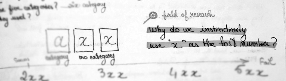
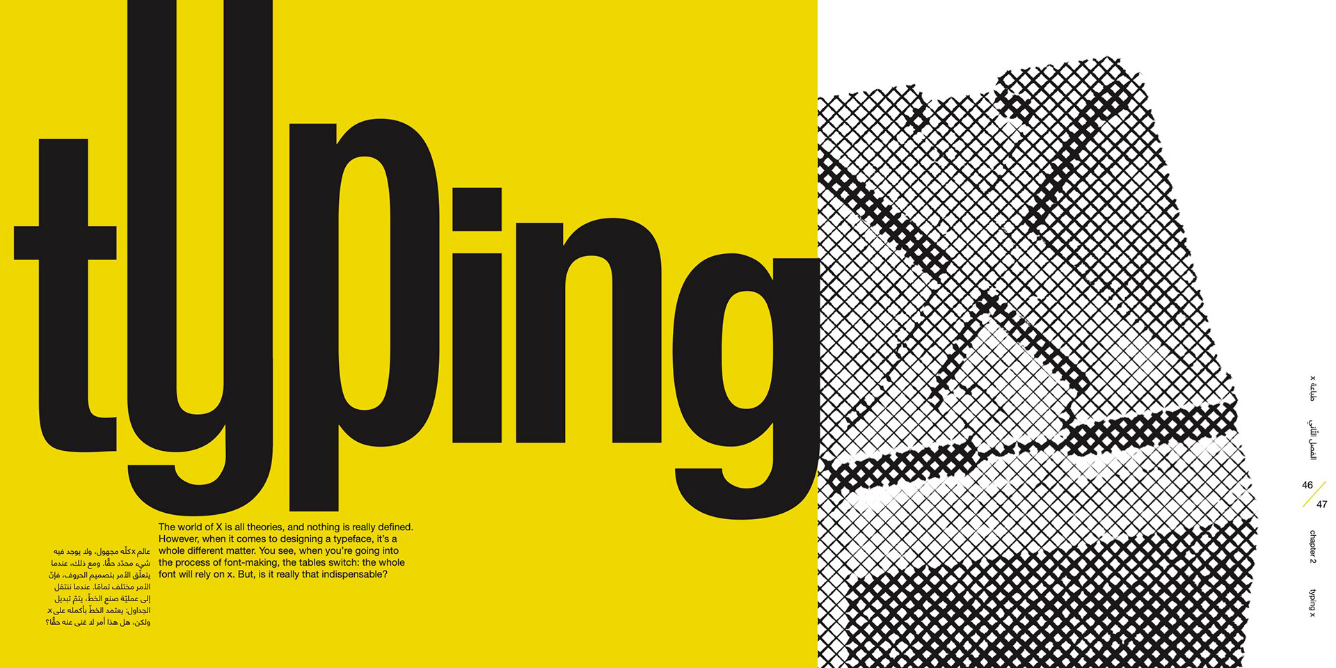
There’s such mystery revolving around ‘x,’ that you could easily get lost in its world. And there’s so much lost information about it that, dare I say, losing 'x' as a letter would actually make sense. Crazy, I know. The book guides you through my research. So, you could say I ended up designing my research sketchbook itself, and the book makes you get lost in the process of coming up with the Design Solution
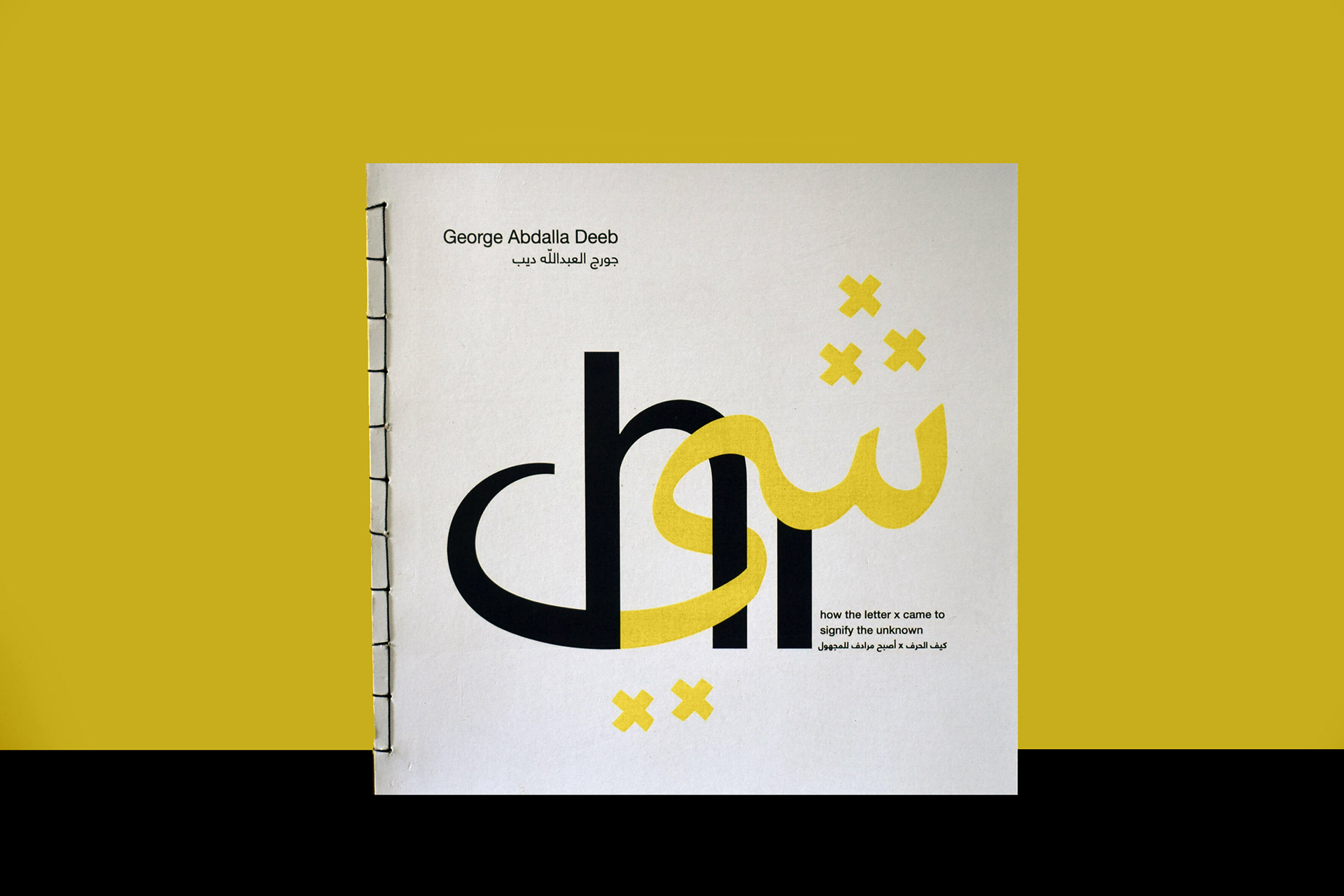
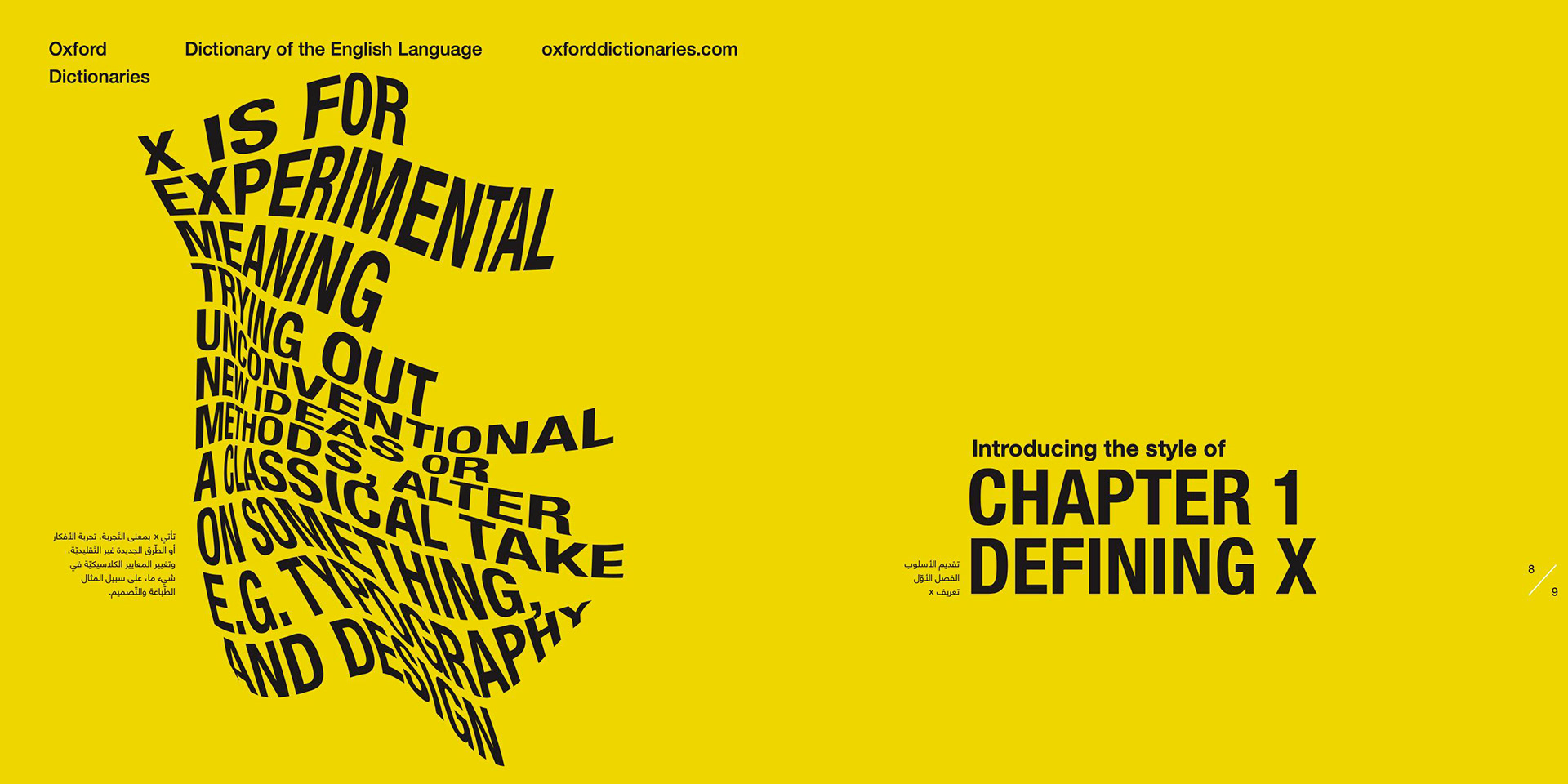
The Title
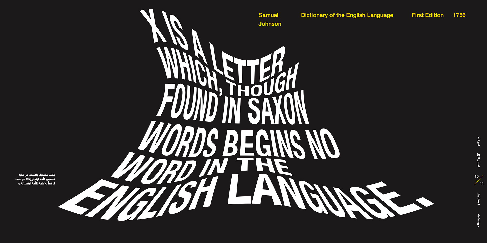
The letter ‘x’ wasn’t always named that way (eks.)
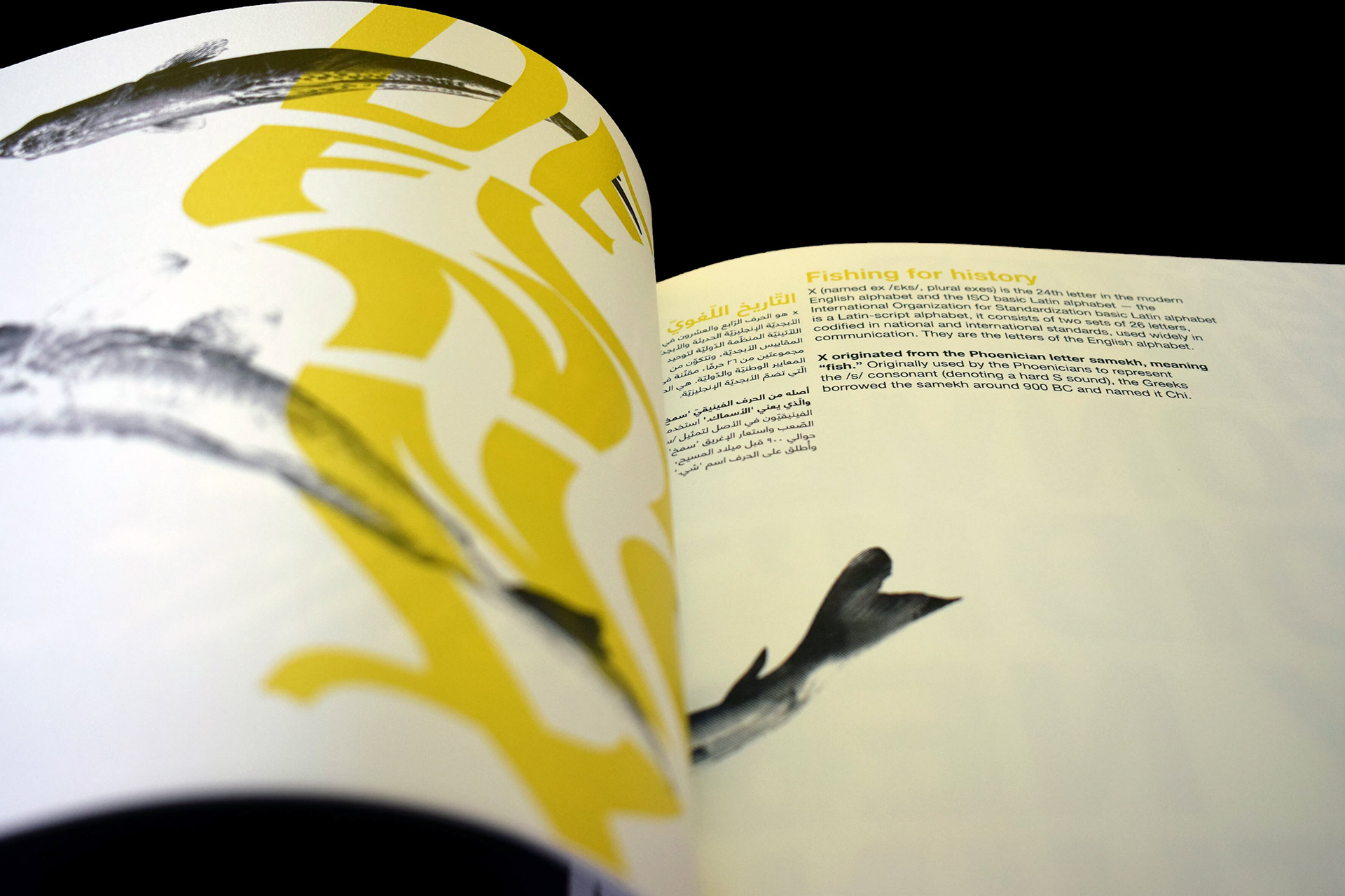
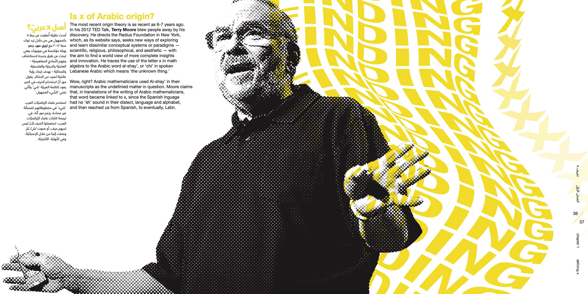
In Ancient Greek, Chi, which was the visual ‘x,’ was among several variations of a similar letter, utilized initially for /kʰ/ (e.g. k in keep.) When the Romans were creating their alphabet, they borrowed Chi’s visual and associated it with the /ks/ sound. Thus, ‘x’ was born from Chi. Interestingly enough, when you transliterate Chi to Arabic, it takes on the meaning of ‘the unknown matter.’ This correlation x=unknown=Chi
embodied the concept of the book perfectly, and it organically landed itself as the title of the publication.
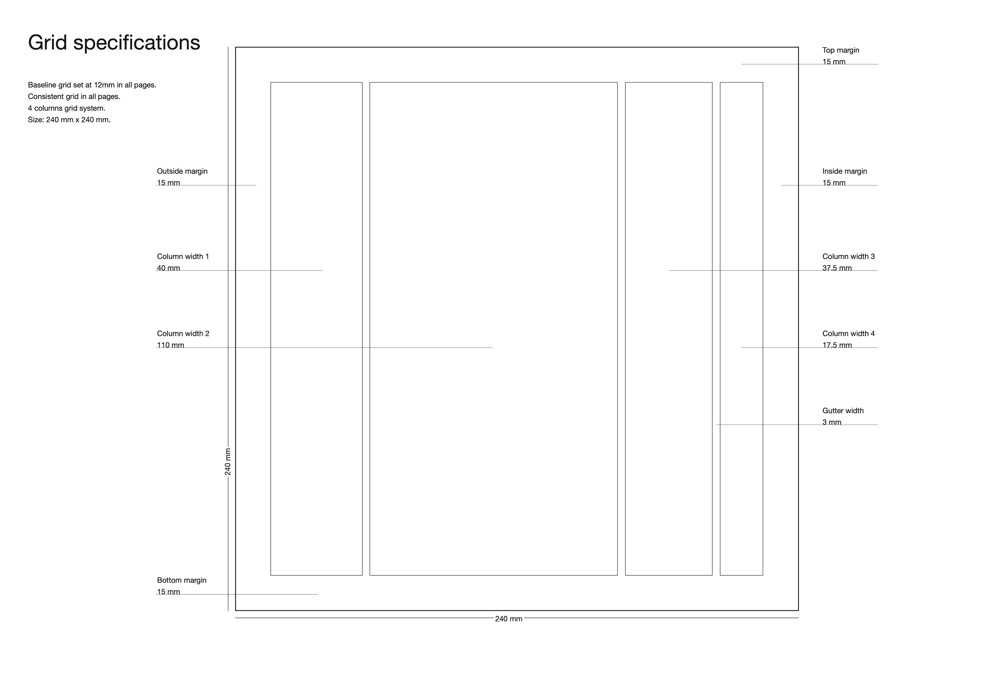
The Format
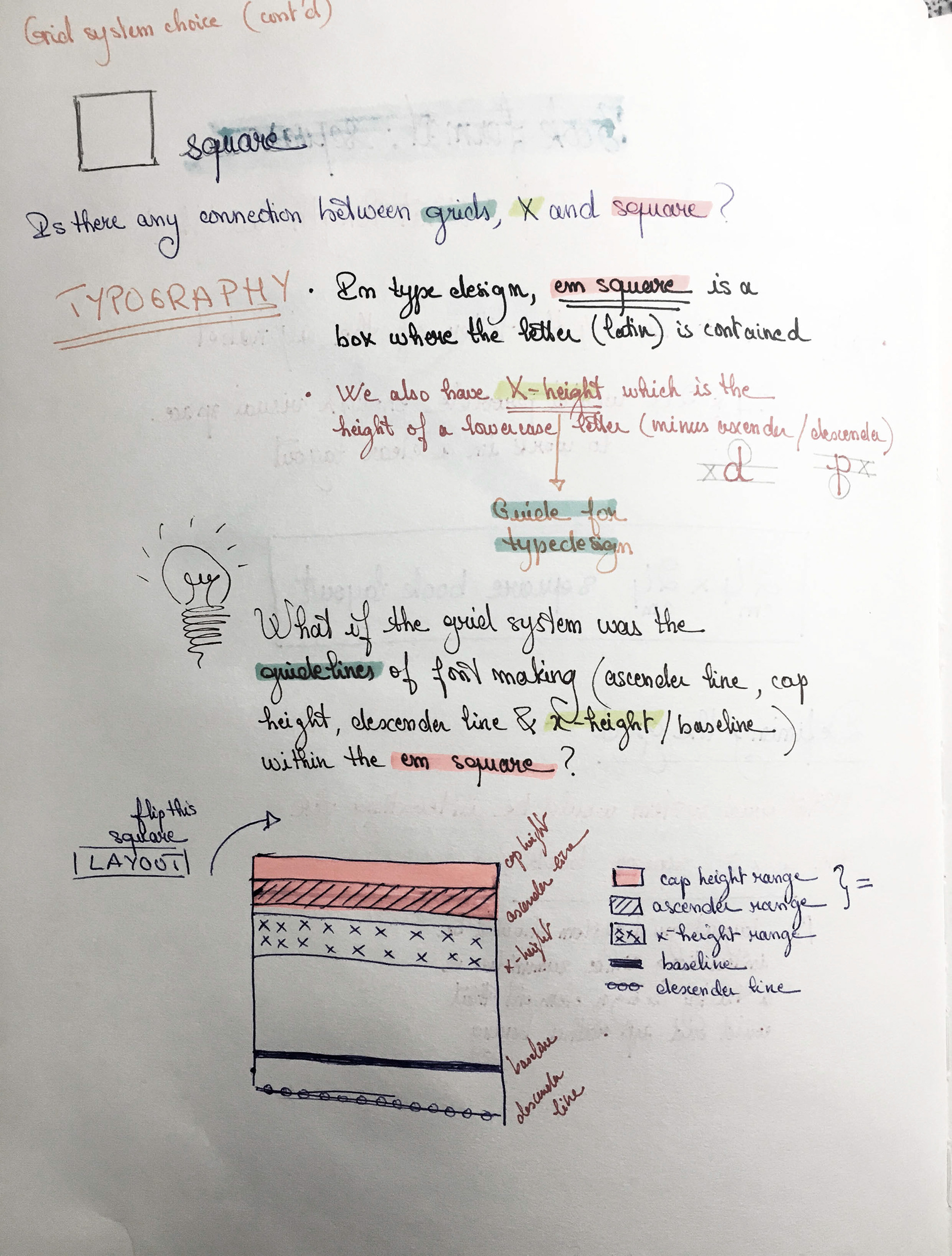
'X’ is a visual dichotomy, meaning it possesses 2 axes of symmetry both horizontal and vertical: just like a square. Thus, the book’s format 24cm x 24cm as you can see in the picture above, & the number 24 came from the simple fact that ‘x’ is the 24th letter of the alphabet.
The Grid System
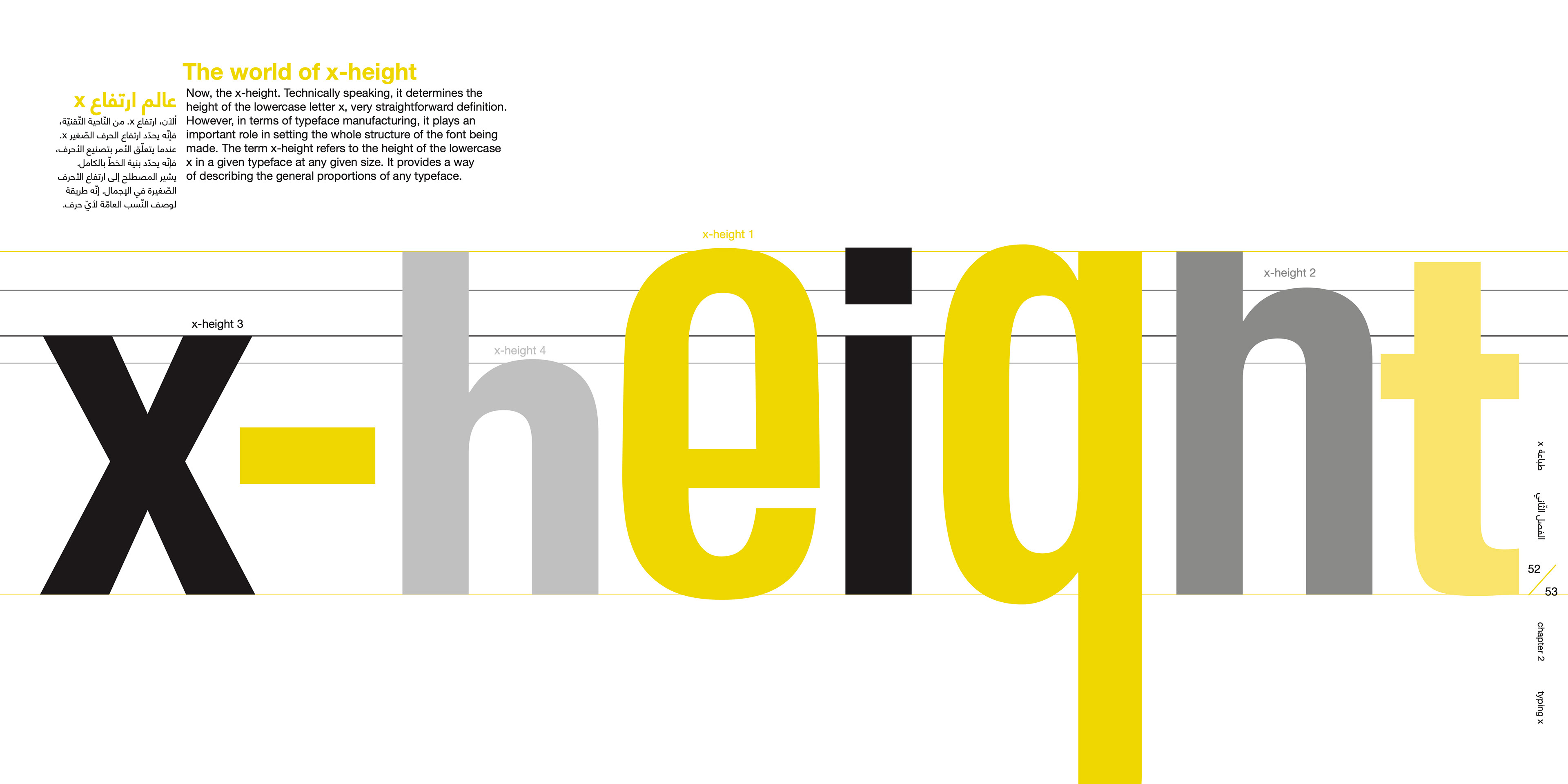
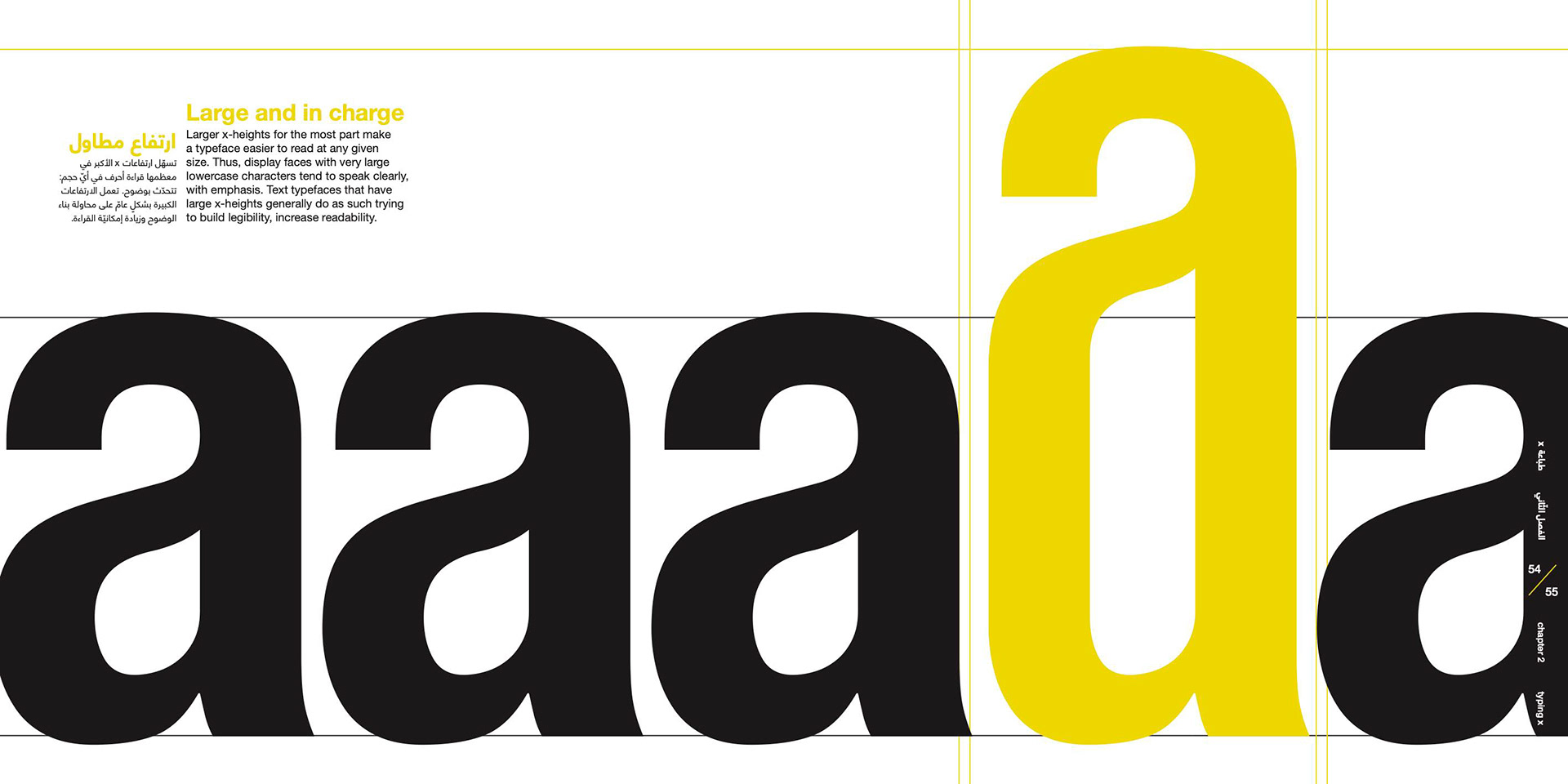
The manufacturing process of a typeface involves a very nice grid it abides by. You have 5 horizontal lines that set the scene: ascender line is high up-top, marks the height of letters with top stems such as the letter 'd' or 't.' Next line is the cap height - slightly lower, used for a capital letter's height 'A' to 'Z.' Then the x-height comes halfway, used to set the height of letters like 'x' and 'z' which have no vertical stems on top or at the bottom. Fourth line is the baseline which is the starting point of all measures, and the last line would be the descender line, measures the vertical bottom stems of letters like 'p' and 'q.'
These 5 lines make a beautiful set of unequal rows that, when rotated to the right, made up an awesome experimental 4 column grid system. Since the only typographic term based on ‘x’ is the x-height, and it is the widest in terms of column creates, all text related to the story of our star letter shall sit in this column that's all about 'x' naturally!
The Visual Treatment
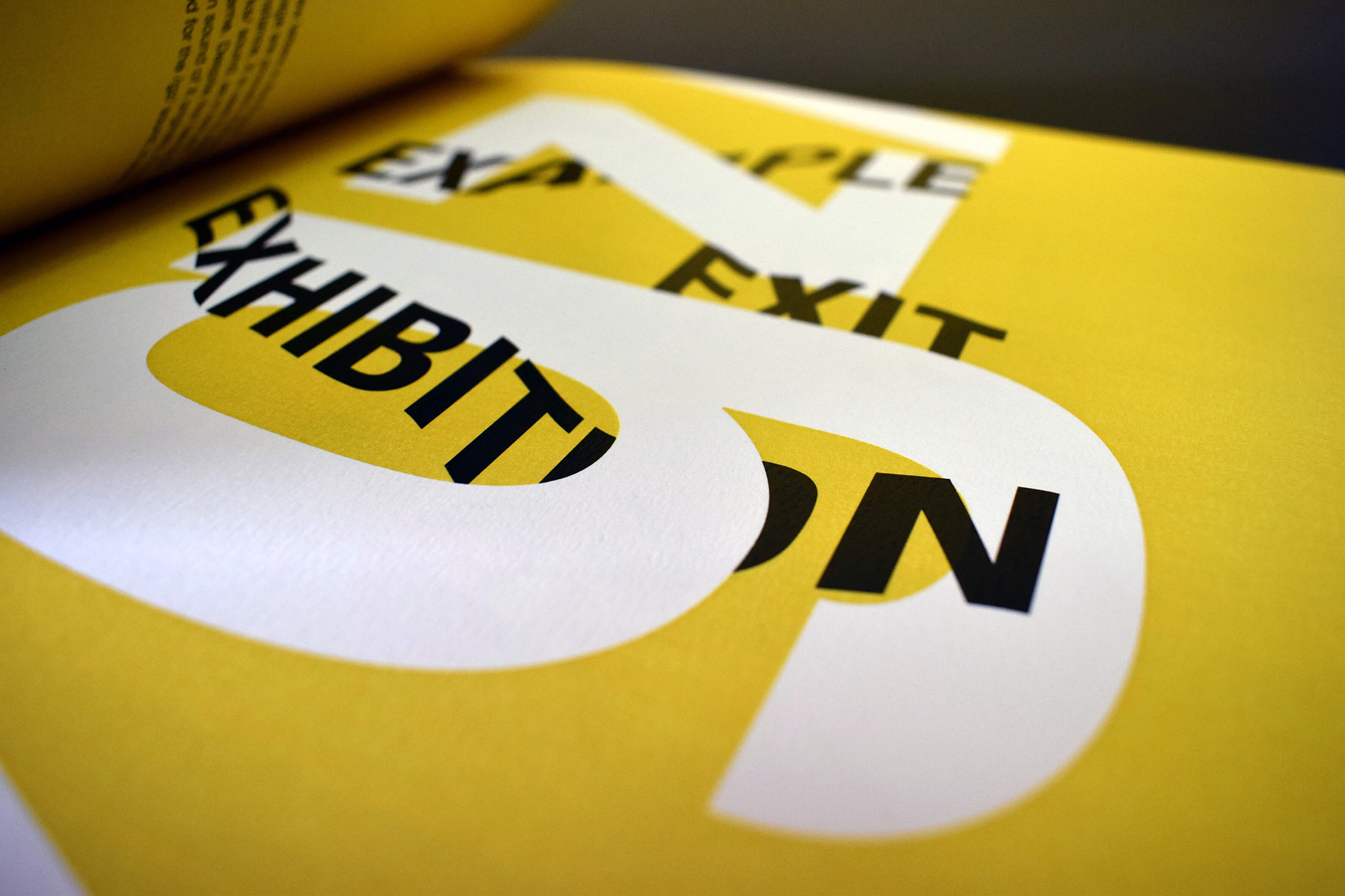
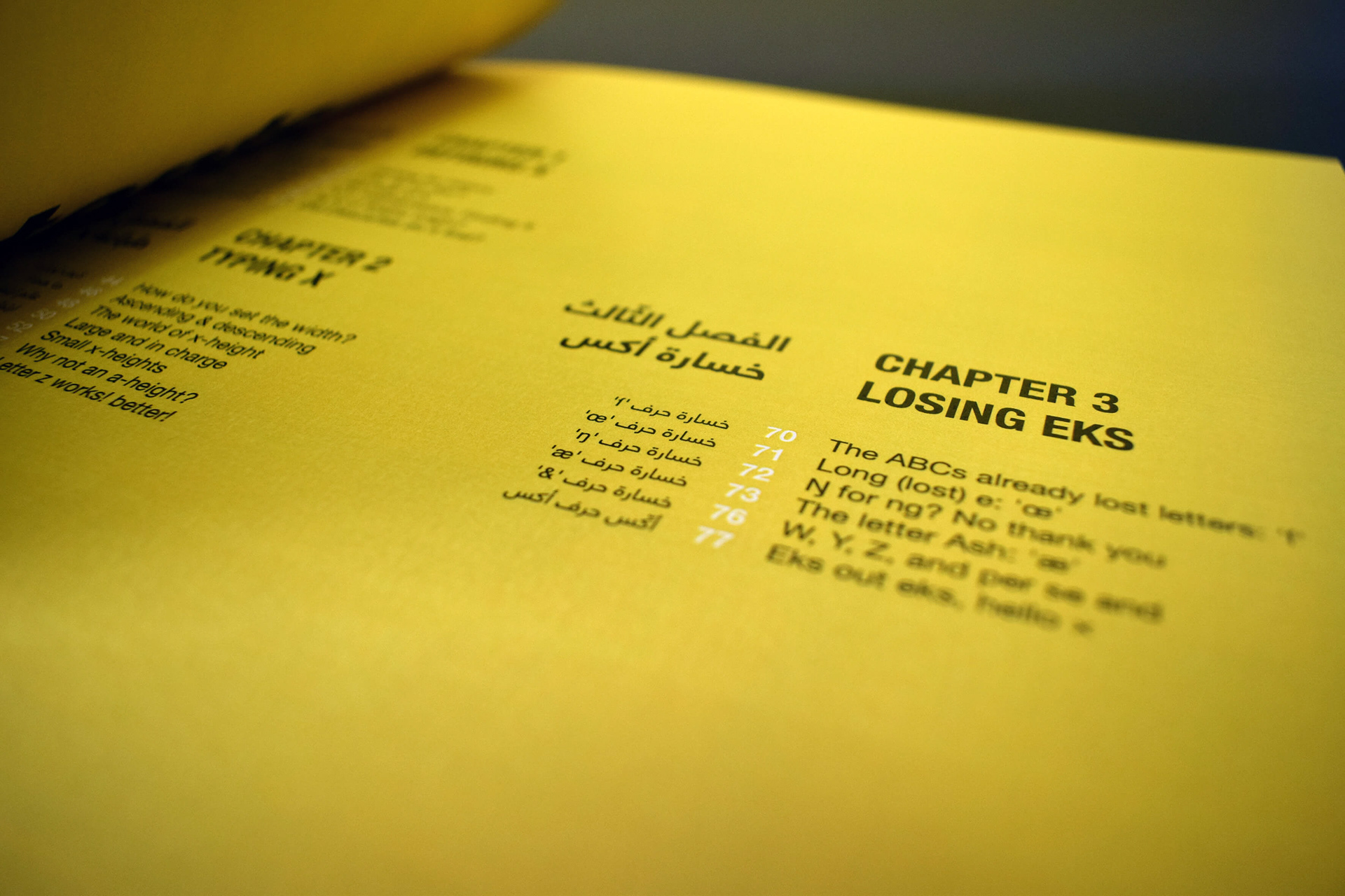
Three chapters, three treatments.
‘X’ has no identity. And what better way to visually show that than to have each chapter designed with a distinct visual treatment. According to the Oxford Dictionaries, ‘x’ is for experimental, ‘x’ is for variability and it is a symbol of magnification. These three key words based the three designs of the chapters.
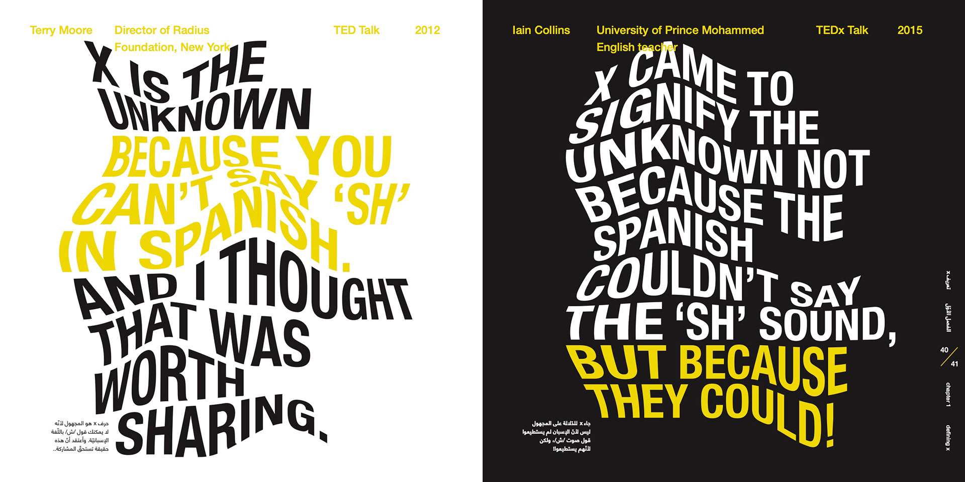
Chapter one was about the experimentation. Organic type, mixed with the already set experimental grid gave the desired ‘mystery x’ and ‘fluid x’ feel.
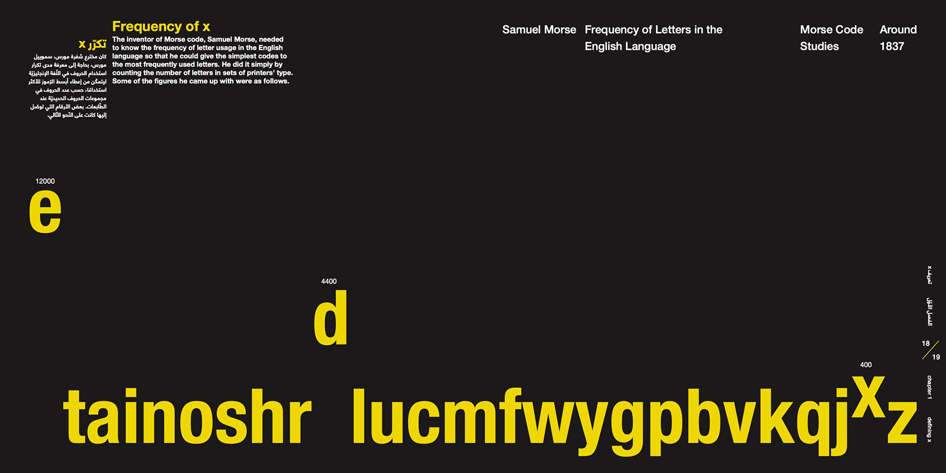
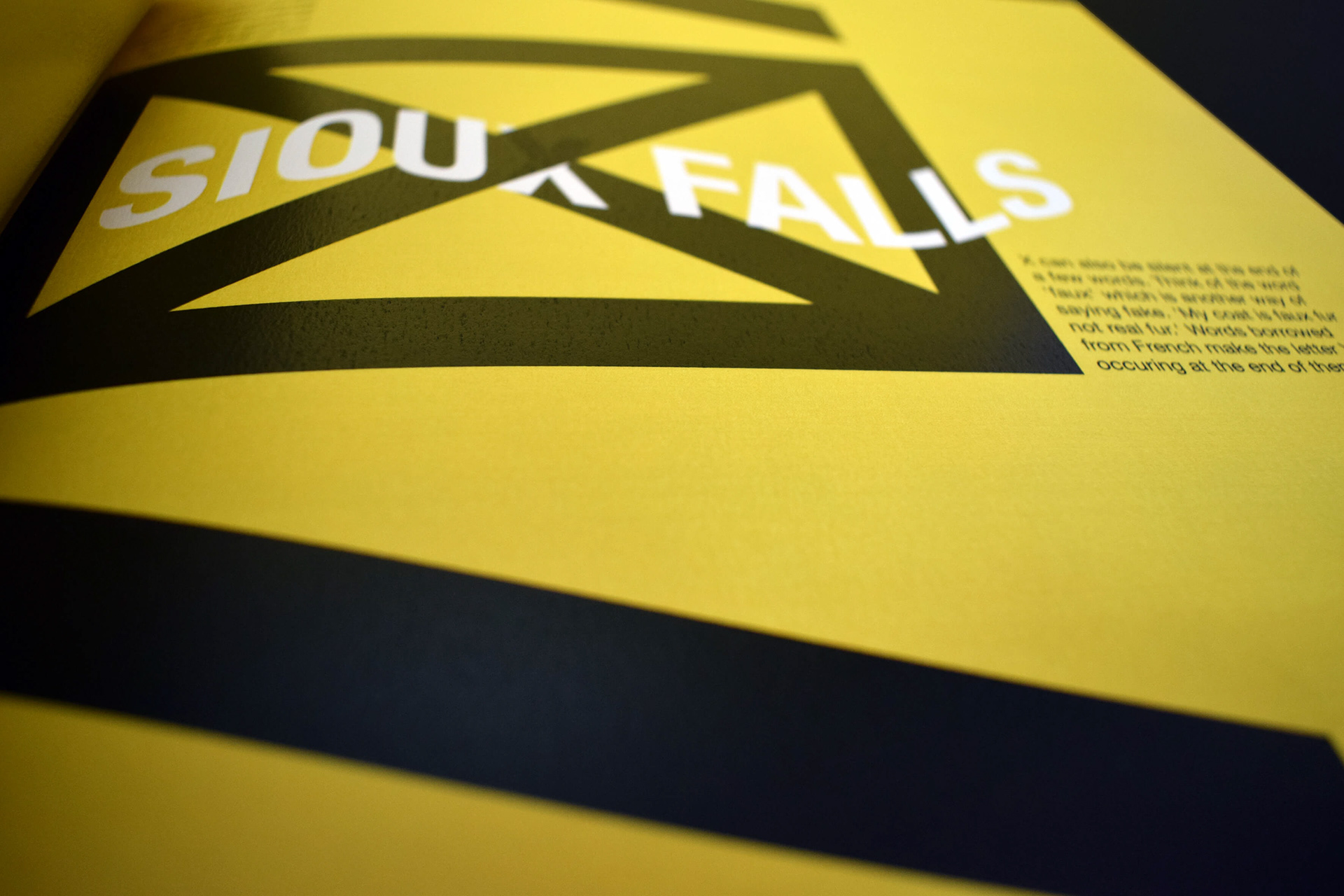
A sub-chapter of chapter one, that talks about the different ways of enunciating x, is printed on yellow backgrounds to grab the attention towards them because they will be an important asset to the book’s storyline. Another important piece of information to the story was the frequency of the usage of ‘x,’ and these spreads are on a solid black background to make them stand out as well.
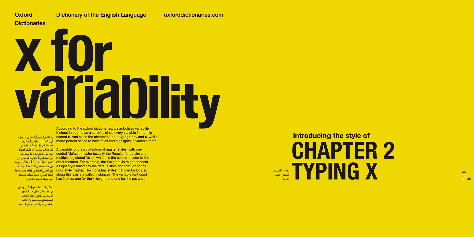
The second chapter was about variability, and if ‘x’ equals variability plus typography, then ‘x’ is definitely equal to variable fonts (Yes, I was a math nerd at school.)
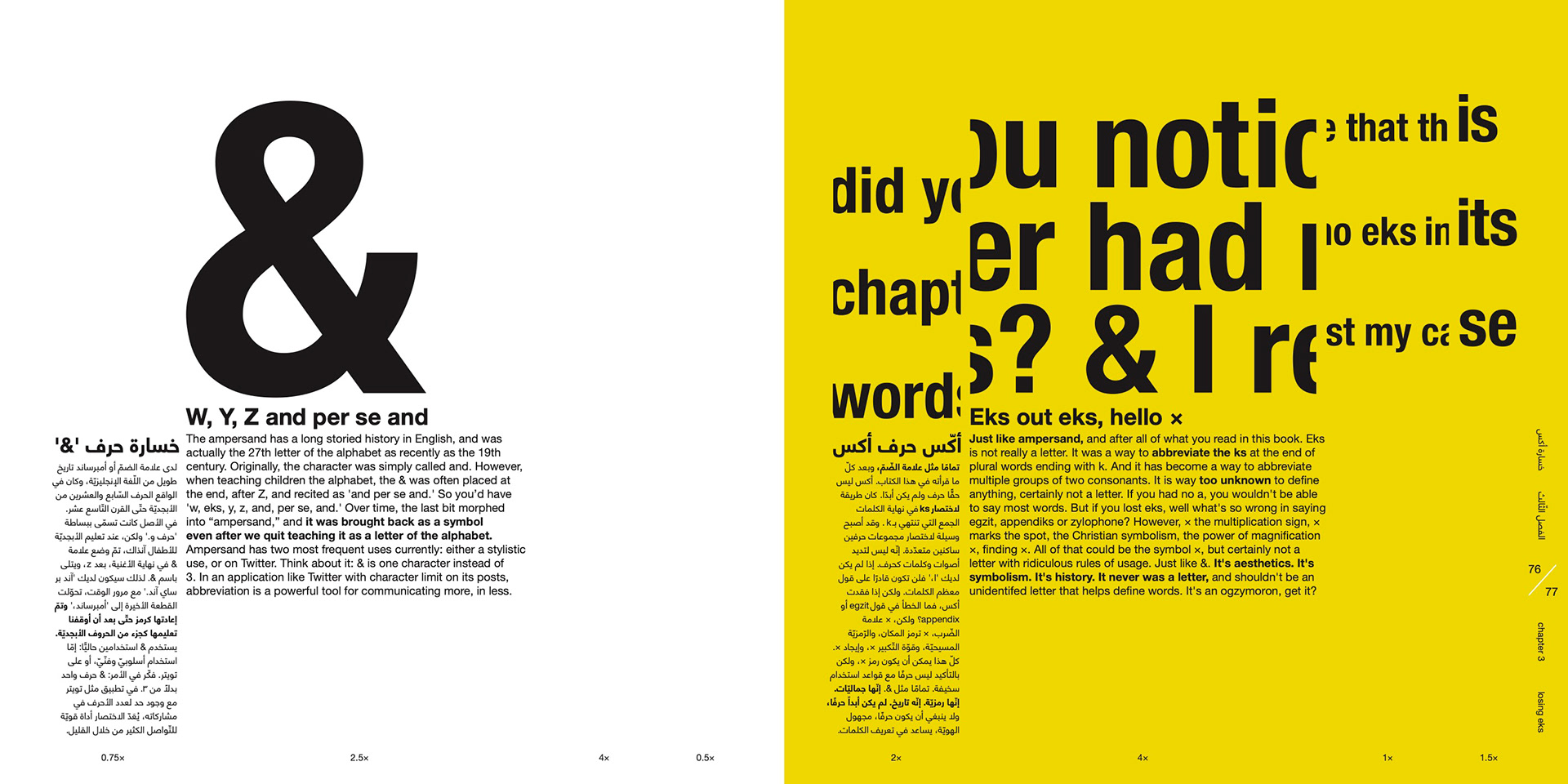
The final chapter was all about magnification. So each column became a power of magnification that affects the display type and graphic elements, but keeping the body text intact for better legibility.
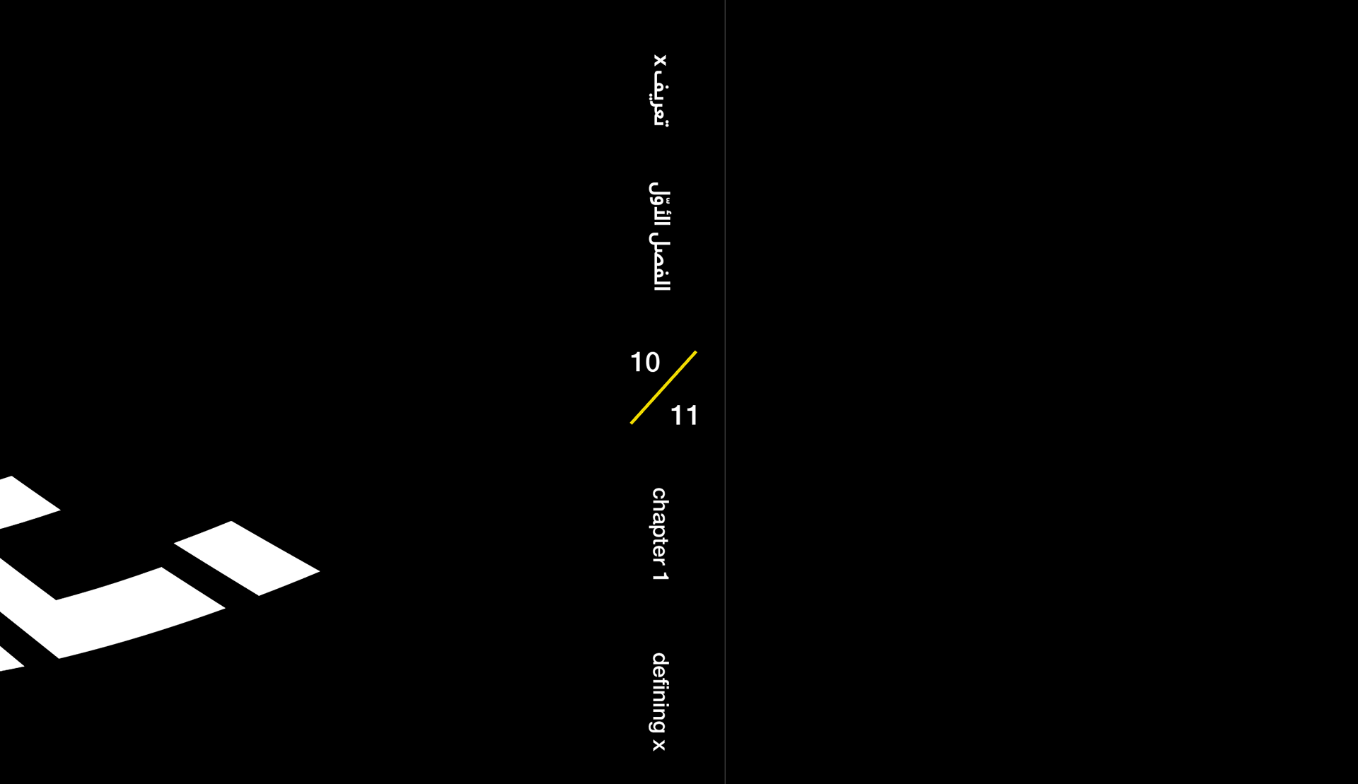
The folio was also designed to look as an ‘x,’ with a line going from bottom left to upper right, and the number layout making an invisible line going from the lower right to the top left.
Geminis talk too much. Anyway, I'm done! Now take a look into the design outcome!
By the way,
this is an awarded project!
ISTD Student Assessment
2019 Winner
this is an awarded project!
ISTD Student Assessment
2019 Winner